How to Create a WordPress Settings Page with React

While building some plugins, I figured creating dynamic applications in WordPress Admin is much easier with React components compared to using PHP and jQuery like back in the old days. However, integrating React components with WordPress Admin can be a bit challenging, especially when it comes to styling and accessibility. This led me to create Kubrick UI.

Kubrick UI is a React-based library offering pre-built, customizable components that seamlessly integrate with the WordPress admin area. It improves both visual consistency and accessibility, making it easier for you to create clean, dynamic interfaces in WordPress Admin, such as creating a Custom Settings Pages.

Before we go further, I’d assume that you’re already familiar with how WordPress plugins work. You’re also familiar with JavaScript, React, and how to install Node.js packages with NPM as we won’t dig into these fundamentals in this tutorial. Otherwise, check out our articles below to help you get up to speed.

If you’re ready, we can now get started with our tutorial on how to create our WordPress Settings page.

Project Structure

First, we are going to create and organize the files required:

.
|-- package.json
|-- settings-page.php
|-- src
    |-- index.js
    |-- App.js
    |-- styles.scss

We have the src directory containing the source files, stylesheet, and JavaScript files, which will contain the app components and the styles. We also created settings-page.php, which contains the WordPress plugin header so that we can load our code as a plugin in WordPress. Lastly, we have package.json so we can install some NPM packages.

NPM Packages

Next, we are going to install the @syntatis/kubrick package for our UI components, as well as a few other packages that it depends on and some that we need to build the page: @wordpress/api-fetch, @wordpress/dom-ready, react, and react-dom.

npm i @syntatis/kubrick @wordpress/api-fetch @wordpress/dom-ready react react-dom

And the @wordpress/scripts package as a development dependency, to allow us to compile the source files easily.

npm i @wordpress/scripts -D

Running the Scripts

Within the package.json, we add a couple of custom scripts, as follows:

{
    "scripts": {
        "build": "wp-scripts build",
        "start": "wp-scripts start"
    }
}

The build script will allow us to compile the files within the src directory into files that we will load on the Settings Page. During development, we are going to run the start script.

npm run start

After running the script, you should find the compiled files in the build directory:

.
|-- index.asset.php
|-- index.css
|-- index.js

Create the Settings Page

There are several steps we are going to do and tie together to create the Settings Page.

First, we are going to update our settings-page.php file to register our settings page in WordPress, and register the settings and the options for the page.

add_action('admin_menu', 'add_submenu');

function add_submenu() {
    add_submenu_page( 
        'options-general.php', // Parent slug.
        'Kubrick Settings',
        'Kubrick',
        'manage_options',
        'kubrick-setting',
        function () { 
            ?>
            <div class="wrap">
                <h1><?php echo esc_html(get_admin_page_title()); ?></h1>
                <div id="kubrick-settings"></div>
                <noscript>
                    <p>
                        <?php esc_html_e('This settings page requires JavaScript to be enabled in your browser. Please enable JavaScript and reload the page.', 'settings-page-example'); ?>
                    </p>
                </noscript>
            </div>
            <?php
        },
    );
}

function register_settings() {
    register_setting( 'kubrick_option_group', 'admin_footer_text', [
        'type' => 'string', 
        'sanitize_callback' => 'sanitize_text_field',
        'default' => 'footer text',
        'show_in_rest' => true,
    ] ); 
}

add_action('admin_init',  'register_settings');
add_action('rest_api_init',  'register_settings');

Here, we are adding a submenu page under the Settings menu in WordPress Admin. We also register the settings and options for the page. The register_setting function is used to register the setting, and the show_in_rest parameter is set to true, which is important to make the setting and the option available in the WordPress /wp/v2/settings REST API.

The next thing we are going to do is enqueue the stylesheet and JavaScript files that we have compiled in the build directory. We are going to do this by adding an action hook to the admin_enqueue_scripts action.

add_action('admin_enqueue_scripts', function () {
    $assets = include plugin_dir_path(__FILE__) . 'build/index.asset.php';

    wp_enqueue_script(
        'kubrick-setting', 
        plugin_dir_url(__FILE__) . 'build/index.js',
        $assets['dependencies'], 
        $assets['version'],
        true
    );

    wp_enqueue_style(
        'kubrick-setting', 
        plugin_dir_url(__FILE__) . 'build/index.css',
        [], 
        $assets['version']
    );
});

If you load WordPress Admin, you should now see the new submenu under Settings. On the page of this submenu, we render a div with the ID root where we are going to render our React application.

WordPress Settings Page with React.js

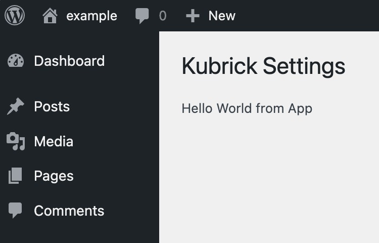
At this point, there’s nothing to see on the page just yet. We will need to create a React component and render it on the page.

Creating a React component

To create the React application, we first add the App function component in our App.js file. We also import the index.css from the @syntatis/kubrick package within this file to apply the basic styles to some of the components.

import '@syntatis/kubrick/dist/index.css';
    
export const App = () => {
    return <p>Hello World from App</p>;
};

In the index.js, we load and render our App component with React.

import domReady from '@wordpress/dom-ready';
import { createRoot } from 'react-dom/client';
import { App } from './App';

domReady( () => {
    const container = document.querySelector( '#root' );
    if ( container ) {
        createRoot( container ).render( <App /> );
    }
} );
Using the UI components

In this example, we’d like to add a text input on the Settings Page which will allow the user to set the text that will be displayed in the admin footer.

Kubrick UI currently offers around 18 components. To create the example mentioned, we can use the TextField component to create an input field for the “Admin Footer Text” setting, allowing users to modify the text displayed in the WordPress admin footer. The Button component is used to submit the form and save the settings. We also use the Notice component to show feedback to the user, such as when the settings are successfully saved or if an error occurs during the process. The code fetches the current settings on page load and updates them via an API call when the form is submitted.

import { useEffect, useState } from 'react';
import apiFetch from '@wordpress/api-fetch';
import { Button, TextField, Notice } from '@syntatis/kubrick';
import '@syntatis/kubrick/dist/index.css';

export const App = () => {
    const [status, setStatus] = useState(null);
    const [statusMessage, setStatusMessage] = useState(null);
    const [values, setValues] = useState();

    // Load the initial settings when the component mounts.
    useEffect(() => {
        apiFetch({ path: '/wp/v2/settings' })
            .then((data) => {
                setValues({
                    admin_footer_text: data?.admin_footer_text,
                });
            })
            .catch((error) => {
                setStatus('error');
                setStatusMessage('An error occurred. Please try to reload the page.');
                console.error(error);
            });
    }, []);

    // Handle the form submission.
    const handleSubmit = (e) => {
        e.preventDefault();
        const data = new FormData(e.target);

        apiFetch({
            path: '/wp/v2/settings',
            method: 'POST',
            data: {
                admin_footer_text: data.get('admin_footer_text'),
            },
        })
            .then((data) => {
                setStatus('success');
                setStatusMessage('Settings saved.');
                setValues(data);
            })
            .catch((error) => {
                setStatus('error');
                setStatusMessage('An error occurred. Please try again.');
                console.error(error);
            });
    };

    if (!values) {
        return;
    }

    return (
        <>
            {status && <Notice level={status} isDismissable onDismiss={() => setStatus(null)}>{statusMessage}</Notice>}
            <form method="POST" onSubmit={handleSubmit}>
                <table className="form-table" role="presentation">
                    <tbody>
                        <tr>
                            <th scope="row">
                                <label
                                    htmlFor="admin-footer-text"
                                    id="admin-footer-text-label"
                                >
                                    Admin Footer Text
                                </label>
                            </th>
                            <td>
                                <TextField
                                    aria-labelledby="admin-footer-text-label"
                                    id="admin-footer-text"
                                    className="regular-text"
                                    defaultValue={values?.admin_footer_text}
                                    name="admin_footer_text"
                                    description="This text will be displayed in the admin footer."
                                />
                            </td>
                        </tr>
                    </tbody>
                </table>
                <Button type="submit">Save Settings</Button>
            </form>
        </>
    );
};

export default App;    

Conclusion

We’ve just created a simple custom settings page in WordPress using React components and the Kubrick UI library.

Our Settings Page here is not perfect, and there are still many things we could improve. For example, we could add more components to make the page more accessible or add more features to make the page more user-friendly. We could also add more error handling or add more feedback to the user when the settings are saved. Since we’re working with React, you can also make the page more interactive and visually appealing.

I hope this tutorial helps you get started with creating a custom settings page in WordPress using React components. You can find the source code for this tutorial on GitHub, and feel free to use it as a starting point for your own projects.

The post How to Create a WordPress Settings Page with React appeared first on Hongkiat.

CSS min() All The Things

CSS min() All The Things

CSS min() All The Things

Victor Ayomipo

2024-10-17T10:00:00+00:00
2025-03-06T17:04:34+00:00

Did you see this post that Chris Coyier published back in August? He experimented with CSS container query units, going all in and using them for every single numeric value in a demo he put together. And the result was… not too bad, actually.

See the Pen [Container Units for All Units [forked]](https://codepen.io/smashingmag/pen/ExqWXOQ) by Chris Coyier.

See the Pen Container Units for All Units [forked] by Chris Coyier.

What I found interesting about this is how it demonstrates the complexity of sizing things. We’re constrained to absolute and relative units in CSS, so we’re either stuck at a specific size (e.g., px) or computing the size based on sizing declared on another element (e.g., %, em, rem, vw, vh, and so on). Both come with compromises, so it’s not like there is a “correct” way to go about things — it’s about the element’s context — and leaning heavily in any one direction doesn’t remedy that.

I thought I’d try my own experiment but with the CSS min() function instead of container query units. Why? Well, first off, we can supply the function with any type of length unit we want, which makes the approach a little more flexible than working with one type of unit. But the real reason I wanted to do this is personal interest more than anything else.

The Demo

I won’t make you wait for the end to see how my min() experiment went:

We’ll talk about that more after we walk through the details.

A Little About min()

The min() function takes two values and applies the smallest one, whichever one happens to be in the element’s context. For example, we can say we want an element to be as wide as 50% of whatever container it is in. And if 50% is greater than, say 200px, cap the width there instead.

See the Pen [[forked]](https://codepen.io/smashingmag/pen/LYwWLMg) by Geoff Graham.

See the Pen [forked] by Geoff Graham.

So, min() is sort of like container query units in the sense that it is aware of how much available space it has in its container. But it’s different in that min() isn’t querying its container dimensions to compute the final value. We supply it with two acceptable lengths, and it determines which is best given the context. That makes min() (and max() for that matter) a useful tool for responsive layouts that adapt to the viewport’s size. It uses conditional logic to determine the “best” match, which means it can help adapt layouts without needing to reach for CSS media queries.

.element {
  width: min(200px, 50%);
}

/* Close to this: */
.element {
  width: 200px;

  @media (min-width: 600px) {
    width: 50%;
  }
}

The difference between min() and @media in that example is that we’re telling the browser to set the element’s width to 50% at a specific breakpoint of 600px. With min(), it switches things up automatically as the amount of available space changes, whatever viewport size that happens to be.

When I use the min(), I think of it as having the ability to make smart decisions based on context. We don’t have to do the thinking or calculations to determine which value is used. However, using min() coupled with just any CSS unit isn’t enough. For instance, relative units work better for responsiveness than absolute units. You might even think of min() as setting a maximum value in that it never goes below the first value but also caps itself at the second value.

I mentioned earlier that we could use any type of unit in min(). Let’s take the same approach that Chris did and lean heavily into a type of unit to see how min() behaves when it is used exclusively for a responsive layout. Specifically, we’ll use viewport units as they are directly relative to the size of the viewport.

Now, there are different flavors of viewport units. We can use the viewport’s width (vw) and height (vh). We also have the vmin and vmax units that are slightly more intelligent in that they evaluate an element’s width and height and apply either the smaller (vmin) or larger (vmax) of the two. So, if we declare 100vmax on an element, and that element is 500px wide by 250px tall, the unit computes to 500px.

That is how I am approaching this experiment. What happens if we eschew media queries in favor of only using min() to establish a responsive layout and lean into viewport units to make it happen? We’ll take it one piece at a time.

Font Sizing

There are various approaches for responsive type. Media queries are quickly becoming the “old school” way of doing it:

p { font-size: 1.1rem; }

@media (min-width: 1200px) {
  p { font-size: 1.2rem; }
}

@media (max-width: 350px) {
  p { font-size: 0.9rem; }
}

Sure, this works, but what happens when the user uses a 4K monitor? Or a foldable phone? There are other tried and true approaches; in fact, clamp() is the prevailing go-to. But we’re leaning all-in on min(). As it happens, just one line of code is all we need to wipe out all of those media queries, substantially reducing our code:

p { font-size: min(6vmin, calc(1rem + 0.23vmax)); }

I’ll walk you through those values…

  1. 6vmin is essentially 6% of the browser’s width or height, whichever is smallest. This allows the font size to shrink as much as needed for smaller contexts.
  2. For calc(1rem + 0.23vmax), 1rem is the base font size, and 0.23vmax is a tiny fraction of the viewport‘s width or height, whichever happens to be the largest.
  3. The calc() function adds those two values together. Since 0.23vmax is evaluated differently depending on which viewport edge is the largest, it’s crucial when it comes to scaling the font size between the two arguments. I’ve tweaked it into something that scales gradually one way or the other rather than blowing things up as the viewport size increases.
  4. Finally, the min() returns the smallest value suitable for the font size of the current screen size.

And speaking of how flexible the min() approach is, it can restrict how far the text grows. For example, we can cap this at a maximum font-size equal to 2rem as a third function parameter:

p { font-size: min(6vmin, calc(1rem + 0.23vmax), 2rem); }

This isn’t a silver bullet tactic. I’d say it’s probably best used for body text, like paragraphs. We might want to adjust things a smidge for headings, e.g., <h1>:

h1 { font-size: min(7.5vmin, calc(2rem + 1.2vmax)); }

We’ve bumped up the minimum size from 6vmin to 7.5vmin so that it stays larger than the body text at any viewport size. Also, in the calc(), the base size is now 2rem, which is smaller than the default UA styles for <h1>. We’re using 1.2vmax as the multiplier this time, meaning it grows more than the body text, which is multiplied by a smaller value, .023vmax.

This works for me. You can always tweak these values and see which works best for your use. Whatever the case, the font-size for this experiment is completely fluid and completely based on the min() function, adhering to my self-imposed constraint.

Margin And Padding

Spacing is a big part of layout, responsive or not. We need margin and padding to properly situate elements alongside other elements and give them breathing room, both inside and outside their box.

We’re going all-in with min() for this, too. We could use absolute units, like pixels, but those aren’t exactly responsive.

min() can combine relative and absolute units so they are more effective. Let’s pair vmin with px this time:

div { margin: min(10vmin, 30px); }

10vmin is likely to be smaller than 30px when viewed on a small viewport. That’s why I’m allowing the margin to shrink dynamically this time around. As the viewport size increases, whereby 10vmin exceeds 30px, min() caps the value at 30px, going no higher than that.

Notice, too, that I didn’t reach for calc() this time. Margins don’t really need to grow indefinitely with screen size, as too much spacing between containers or elements generally looks awkward on larger screens. This concept also works extremely well for padding, but we don’t have to go there. Instead, it might be better to stick with a single unit, preferably em, since it is relative to the element’s font-size. We can essentially “pass” the work that min() is doing on the font-size to the margin and padding properties because of that.

.card-info {
  font-size: min(6vmin, calc(1rem + 0.12vmax));
  padding: 1.2em;
}

Now, padding scales with the font-size, which is powered by min().

Widths

Setting width for a responsive design doesn’t have to be complicated, right? We could simply use a single percentage or viewport unit value to specify how much available horizontal space we want to take up, and the element will adjust accordingly. Though, container query units could be a happy path outside of this experiment.

But we’re min() all the way!

min() comes in handy when setting constraints on how much an element responds to changes. We can set an upper limit of 650px and, if the computed width tries to go larger, have the element settle at a full width of 100%:

.container { width: min(100%, 650px); }

Things get interesting with text width. When the width of a text box is too long, it becomes uncomfortable to read through the texts. There are competing theories about how many characters per line of text is best for an optimal reading experience. For the sake of argument, let’s say that number should be between 50-75 characters. In other words, we ought to pack no more than 75 characters on a line, and we can do that with the ch unit, which is based on the 0 character’s size for whatever font is in use.

p {
  width: min(100%, 75ch);
}

This code basically says: get as wide as needed but never wider than 75 characters.

Sizing Recipes Based On min()

Over time, with a lot of tweaking and modifying of values, I have drafted a list of pre-defined values that I find work well for responsively styling different properties:

:root {
  --font-size-6x: min(7.5vmin, calc(2rem + 1.2vmax));
  --font-size-5x: min(6.5vmin, calc(1.1rem + 1.2vmax));
  --font-size-4x: min(4vmin, calc(0.8rem + 1.2vmax));
  --font-size-3x: min(6vmin, calc(1rem + 0.12vmax));
  --font-size-2x: min(4vmin, calc(0.85rem + 0.12vmax));
  --font-size-1x: min(2vmin, calc(0.65rem + 0.12vmax));
  --width-2x: min(100vw, 1300px);
  --width-1x: min(100%, 1200px);
  --gap-3x: min(5vmin, 1.5rem);
  --gap-2x: min(4.5vmin, 1rem);
  --size-10x: min(15vmin, 5.5rem);
  --size-9x: min(10vmin, 5rem);
  --size-8x: min(10vmin, 4rem);
  --size-7x: min(10vmin, 3rem);
  --size-6x: min(8.5vmin, 2.5rem);
  --size-5x: min(8vmin, 2rem);
  --size-4x: min(8vmin, 1.5rem);
  --size-3x: min(7vmin, 1rem);
  --size-2x: min(5vmin, 1rem);
  --size-1x: min(2.5vmin, 0.5rem);
}

This is how I approached my experiment because it helps me know what to reach for in a given situation:

h1 { font-size: var(--font-size-6x); }

.container {
  width: var(--width-2x);
  margin: var(--size-2x);
}

.card-grid { gap: var(--gap-3x); }

There we go! We have a heading that scales flawlessly, a container that’s responsive and never too wide, and a grid with dynamic spacing — all without a single media query. The --size- properties declared in the variable list are the most versatile, as they can be used for properties that require scaling, e.g., margins, paddings, and so on.

The Final Result, Again

I shared a video of the result, but here’s a link to the demo.

See the Pen [min() website [forked]](https://codepen.io/smashingmag/pen/wvVdPxL) by Vayo.

See the Pen min() website [forked] by Vayo.

So, is min() the be-all, end-all for responsiveness? Absolutely not. Neither is a diet consisting entirely of container query units. I mean, it’s cool that we can scale an entire webpage like this, but the web is never a one-size-fits-all beanie.

If anything, I think this and what Chris demoed are warnings against dogmatic approaches to web design as a whole, not solely unique to responsive design. CSS features, including length units and functions, are tools in a larger virtual toolshed. Rather than getting too cozy with one feature or technique, explore the shed because you might find a better tool for the job.

Smashing Editorial
(gg, yk)