Transitioning Top-Layer Entries And The Display Property In CSS

Transitioning Top-Layer Entries And The Display Property In CSS

Transitioning Top-Layer Entries And The Display Property In CSS

Brecht De Ruyte

2025-01-29T10:00:00+00:00
2025-03-06T17:04:34+00:00

Animating from and to display: none; was something we could only achieve with JavaScript to change classes or create other hacks. The reason why we couldn’t do this in CSS is explained in the new CSS Transitions Level 2 specification:

“In Level 1 of this specification, transitions can only start during a style change event for elements that have a defined before-change style established by the previous style change event. That means a transition could not be started on an element that was not being rendered for the previous style change event.”

In simple terms, this means that we couldn’t start a transition on an element that is hidden or that has just been created.

What Does transition-behavior: allow-discrete Do?

allow-discrete is a bit of a strange name for a CSS property value, right? We are going on about transitioning display: none, so why isn’t this named transition-behavior: allow-display instead? The reason is that this does a bit more than handling the CSS display property, as there are other “discrete” properties in CSS. A simple rule of thumb is that discrete properties do not transition but usually flip right away between two states. Other examples of discrete properties are visibility and mix-blend-mode. I’ll include an example of these at the end of this article.

To summarise, setting the transition-behavior property to allow-discrete allows us to tell the browser it can swap the values of a discrete property (e.g., display, visibility, and mix-blend-mode) at the 50% mark instead of the 0% mark of a transition.

What Does @starting-style Do?

The @starting-style rule defines the styles of an element right before it is rendered to the page. This is highly needed in combination with transition-behavior and this is why:

When an item is added to the DOM or is initially set to display: none, it needs some sort of “starting style” from which it needs to transition. To take the example further, popovers and dialog elements are added to a top layer which is a layer that is outside of your document flow, you can kind of look at it as a sibling of the <html> element in your page’s structure. Now, when opening this dialog or popover, they get created inside that top layer, so they don’t have any styles to start transitioning from, which is why we set @starting-style. Don’t worry if all of this sounds a bit confusing. The demos might make it more clearly. The important thing to know is that we can give the browser something to start the animation with since it otherwise has nothing to animate from.

A Note On Browser Support

At the moment of writing, the transition-behavior is available in Chrome, Edge, Safari, and Firefox. It’s the same for @starting-style, but Firefox currently does not support animating from display: none. But remember that everything in this article can be perfectly used as a progressive enhancement.

Now that we have the theory of all this behind us, let’s get practical. I’ll be covering three use cases in this article:

  • Animating from and to display: none in the DOM.
  • Animating dialogs and popovers entering and exiting the top layer.
  • More “discrete properties” we can handle.

Animating From And To display: none In The DOM

For the first example, let’s take a look at @starting-style alone. I created this demo purely to explain the magic. Imagine you want two buttons on a page to add or remove list items inside of an unordered list.

This could be your starting HTML:

<button type="button" class="btn-add">
  Add item
</button>
<button type="button" class="btn-remove">
  Remove item
</button>
<ul role="list"></ul>

Next, we add actions that add or remove those list items. This can be any method of your choosing, but for demo purposes, I quickly wrote a bit of JavaScript for it:

document.addEventListener("DOMContentLoaded", () => {
  const addButton = document.querySelector(".btn-add");
  const removeButton = document.querySelector(".btn-remove");
  const list = document.querySelector('ul[role="list"]');

  addButton.addEventListener("click", () => {
    const newItem = document.createElement("li");
    list.appendChild(newItem);
  });

  removeButton.addEventListener("click", () => {
    if (list.lastElementChild) {
      list.lastElementChild.classList.add("removing");
      setTimeout(() => {
        list.removeChild(list.lastElementChild);
      }, 200);
    }
  });
});

When clicking the addButton, an empty list item gets created inside of the unordered list. When clicking the removeButton, the last item gets a new .removing class and finally gets taken out of the DOM after 200ms.

With this in place, we can write some CSS for our items to animate the removing part:

ul {
    li {
      transition: opacity 0.2s, transform 0.2s;

      &.removing {
        opacity: 0;
        transform: translate(0, 50%);
      }
    }
  }

This is great! Our .removing animation is already looking perfect, but what we were looking for here was a way to animate the entry of items coming inside of our DOM. For this, we will need to define those starting styles, as well as the final state of our list items.

First, let’s update the CSS to have the final state inside of that list item:

ul {
    li {
      opacity: 1;
      transform: translate(0, 0);
      transition: opacity 0.2s, transform 0.2s;

      &.removing {
        opacity: 0;
        transform: translate(0, 50%);
      }
    }
  }

Not much has changed, but now it’s up to us to let the browser know what the starting styles should be. We could set this the same way we did the .removing styles like so:

ul {
    li {
      opacity: 1;
      transform: translate(0, 0);
      transition: opacity 0.2s, transform 0.2s;

      @starting-style {
        opacity: 0;
        transform: translate(0, 50%);
      }

      &.removing {
        opacity: 0;
        transform: translate(0, 50%);
      }
    }
  }

Now we’ve let the browser know that the @starting-style should include zero opacity and be slightly nudged to the bottom using a transform. The final result is something like this:

But we don’t need to stop there! We could use different animations for entering and exiting. We could, for example, update our starting style to the following:

@starting-style {
  opacity: 0;
  transform: translate(0, -50%);
}

Doing this, the items will enter from the top and exit to the bottom. See the full example in this CodePen:

See the Pen [@starting-style demo – up-in, down-out [forked]](https://codepen.io/smashingmag/pen/XJroPgg) by utilitybend.

See the Pen @starting-style demo – up-in, down-out [forked] by utilitybend.

When To Use transition-behavior: allow-discrete

In the previous example, we added and removed items from our DOM. In the next demo, we will show and hide items using the CSS display property. The basic setup is pretty much the same, except we will add eight list items to our DOM with the .hidden class attached to it:

  <button type="button" class="btn-add">
    Show item
  </button>
  <button type="button" class="btn-remove">
    Hide item
  </button>

<ul role="list">
  <li class="hidden"></li>
  <li class="hidden"></li>
  <li class="hidden"></li>
  <li class="hidden"></li>
  <li class="hidden"></li>
  <li class="hidden"></li>
  <li class="hidden"></li>
  <li class="hidden"></li>
</ul>

Once again, for demo purposes, I added a bit of JavaScript that, this time, removes the .hidden class of the next item when clicking the addButton and adds the hidden class back when clicking the removeButton:

document.addEventListener("DOMContentLoaded", () => {
  const addButton = document.querySelector(".btn-add");
  const removeButton = document.querySelector(".btn-remove");
  const listItems = document.querySelectorAll('ul[role="list"] li');

  let activeCount = 0;

  addButton.addEventListener("click", () => {
    if (activeCount < listItems.length) {
      listItems[activeCount].classList.remove("hidden");
      activeCount++;
    }
  });

  removeButton.addEventListener("click", () => {
    if (activeCount > 0) {
      activeCount--;
      listItems[activeCount].classList.add("hidden");
    }
  });
});

Let’s put together everything we learned so far, add a @starting-style to our items, and do the basic setup in CSS:

ul {
    li {
      display: block;
      opacity: 1;
      transform: translate(0, 0);
      transition: opacity 0.2s, transform 0.2s;

      @starting-style {
        opacity: 0;
        transform: translate(0, -50%);
      }

      &.hidden {
        display: none;
        opacity: 0;
        transform: translate(0, 50%);
      }
    }
  }

This time, we have added the .hidden class, set it to display: none, and added the same opacity and transform declarations as we previously did with the .removing class in the last example. As you might expect, we get a nice fade-in for our items, but removing them is still very abrupt as we set our items directly to display: none.

This is where the transition-behavior property comes into play. To break it down a bit more, let’s remove the transition property shorthand of our previous CSS and open it up a bit:

ul {
    li {
      display: block;
      opacity: 1;
      transform: translate(0, 0);
      transition-property: opacity, transform;
      transition-duration: 0.2s;
    }
  }

All that is left to do is transition the display property and set the transition-behavior property to allow-discrete:

ul {
    li {
      display: block;
      opacity: 1;
      transform: translate(0, 0);
      transition-property: opacity, transform, display;
      transition-duration: 0.2s;
      transition-behavior: allow-discrete;
      /* etc. */
    }
  }

We are now animating the element from display: none, and the result is exactly as we wanted it:

We can use the transition shorthand property to make our code a little less verbose:

transition: opacity 0.2s, transform 0.2s, display 0.2s allow-discrete;

You can add allow-discrete in there. But if you do, take note that if you declare a shorthand transition after transition-behavior, it will be overruled. So, instead of this:

transition-behavior: allow-discrete;
transition: opacity 0.2s, transform 0.2s, display 0.2s;

…we want to declare transition-behavior after the transition shorthand:

transition: opacity 0.2s, transform 0.2s, display 0.2s;
transition-behavior: allow-discrete;

Otherwise, the transition shorthand property overrides transition-behavior.

See the Pen [@starting-style and transition-behavior: allow-discrete [forked]](https://codepen.io/smashingmag/pen/GgKPXda) by utilitybend.

See the Pen @starting-style and transition-behavior: allow-discrete [forked] by utilitybend.

Animating Dialogs And Popovers Entering And Exiting The Top Layer

Let’s add a few use cases with dialogs and popovers. Dialogs and popovers are good examples because they get added to the top layer when opening them.

What Is That Top Layer?

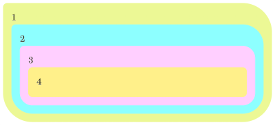
We’ve already likened the “top layer” to a sibling of the <html> element, but you might also think of it as a special layer that sits above everything else on a web page. It’s like a transparent sheet that you can place over a drawing. Anything you draw on that sheet will be visible on top of the original drawing.

The original drawing, in this example, is the DOM. This means that the top layer is out of the document flow, which provides us with a few benefits. For example, as I stated before, dialogs and popovers are added to this top layer, and that makes perfect sense because they should always be on top of everything else. No more z-index: 9999!

But it’s more than that:

  • z-index is irrelevant: Elements on the top layer are always on top, regardless of their z-index value.
  • DOM hierarchy doesn’t matter: An element’s position in the DOM doesn’t affect its stacking order on the top layer.
  • Backdrops: We get access to a new ::backdrop pseudo-element that lets us style the area between the top layer and the DOM beneath it.

Hopefully, you are starting to understand the importance of the top layer and how we can transition elements in and out of it as we would with popovers and dialogues.

Transitioning The Dialog Element In The Top Layer

The following HTML contains a button that opens a <dialog> element, and that <dialog> element contains another button that closes the <dialog>. So, we have one button that opens the <dialog> and one that closes it.

<button class="open-dialog" data-target="my-modal">Show dialog</button>

<dialog id="my-modal">
  <p>Hi, there!</p>
  <button class="outline close-dialog" data-target="my-modal">
    close
  </button>
</dialog>

A lot is happening in HTML with invoker commands that will make the following step a bit easier, but for now, let’s add a bit of JavaScript to make this modal actually work:

// Get all open dialog buttons.
const openButtons = document.querySelectorAll(".open-dialog");
// Get all close dialog buttons.
const closeButtons = document.querySelectorAll(".close-dialog");

// Add click event listeners to open buttons.
openButtons.forEach((button) =< {
  button.addEventListener("click", () =< {
    const targetId = button.getAttribute("data-target");
    const dialog = document.getElementById(targetId);
    if (dialog) {
      dialog.showModal();
    }
  });
});

// Add click event listeners to close buttons.
closeButtons.forEach((button) =< {
  button.addEventListener("click", () =< {
    const targetId = button.getAttribute("data-target");
    const dialog = document.getElementById(targetId);
    if (dialog) {
      dialog.close();
    }
  });
});

I’m using the following styles as a starting point. Notice how I’m styling the ::backdrop as an added bonus!

dialog {
  padding: 30px;
  width: 100%;
  max-width: 600px;
  background: #fff;
  border-radius: 8px;
  border: 0;
  box-shadow: 
    rgba(0, 0, 0, 0.3) 0px 19px 38px,
    rgba(0, 0, 0, 0.22) 0px 15px 12px;
    
  &::backdrop {
    background-image: linear-gradient(
      45deg in oklab,
      oklch(80% 0.4 222) 0%,
      oklch(35% 0.5 313) 100%
    );
  }
}

This results in a pretty hard transition for the entry, meaning it’s not very smooth:

Let’s add transitions to this dialog element and the backdrop. I’m going a bit faster this time because by now, you likely see the pattern and know what’s happening:

dialog {
  opacity: 0;
  translate: 0 30%;
  transition-property: opacity, translate, display;
  transition-duration: 0.8s;

  transition-behavior: allow-discrete;
  
  &[open] {
    opacity: 1;
    translate: 0 0;

    @starting-style {
      opacity: 0;
      translate: 0 -30%;
    }
  }
}

When a dialog is open, the browser slaps an open attribute on it:

<dialog open> ... </dialog>

And that’s something else we can target with CSS, like dialog[open]. So, in this case, we need to set a @starting-style for when the dialog is in an open state.

Let’s add a transition for our backdrop while we’re at it:

dialog {
  /* etc. */
  &::backdrop {
    opacity: 0;
    transition-property: opacity;
    transition-duration: 1s;
  }

  &[open] {
    /* etc. */
    &::backdrop {
      opacity: 0.8;

      @starting-style {
        opacity: 0;
      }
    }
  }
}

Now you’re probably thinking: A-ha! But you should have added the display property and the transition-behavior: allow-discrete on the backdrop!

But no, that is not the case. Even if I would change my backdrop pseudo-element to the following CSS, the result would stay the same:

 &::backdrop {
    opacity: 0;
    transition-property: opacity, display;
    transition-duration: 1s;
    transition-behavior: allow-discrete;
  }

It turns out that we are working with a ::backdrop and when working with a ::backdrop, we’re implicitly also working with the CSS overlay property, which specifies whether an element appearing in the top layer is currently rendered in the top layer.

And overlay just so happens to be another discrete property that we need to include in the transition-property declaration:

dialog {
  /* etc. */

&::backdrop {
  transition-property: opacity, display, overlay;
  /* etc. */
}

Unfortunately, this is currently only supported in Chromium browsers, but it can be perfectly used as a progressive enhancement.

And, yes, we need to add it to the dialog styles as well:

dialog {
  transition-property: opacity, translate, display, overlay;
  /* etc. */

&::backdrop {
  transition-property: opacity, display, overlay;
  /* etc. */
}

See the Pen [Dialog: starting-style, transition-behavior, overlay [forked]](https://codepen.io/smashingmag/pen/pvzqOGe) by utilitybend.

See the Pen Dialog: starting-style, transition-behavior, overlay [forked] by utilitybend.

It’s pretty much the same thing for a popover instead of a dialog. I’m using the same technique, only working with popovers this time:

See the Pen [Popover transition with @starting-style [forked]](https://codepen.io/smashingmag/pen/emObLxe) by utilitybend.

See the Pen Popover transition with @starting-style [forked] by utilitybend.

Other Discrete Properties

There are a few other discrete properties besides the ones we covered here. If you remember the second demo, where we transitioned some items from and to display: none, the same can be achieved with the visibility property instead. This can be handy for those cases where you want items to preserve space for the element’s box, even though it is invisible.

So, here’s the same example, only using visibility instead of display.

See the Pen [Transitioning the visibility property [forked]](https://codepen.io/smashingmag/pen/LEPMJqX) by utilitybend.

See the Pen Transitioning the visibility property [forked] by utilitybend.

The CSS mix-blend-mode property is another one that is considered discrete. To be completely honest, I can’t find a good use case for a demo. But I went ahead and created a somewhat trite example where two mix-blend-modes switch right in the middle of the transition instead of right away.

See the Pen [Transitioning mix-blend-mode [forked]](https://codepen.io/smashingmag/pen/bNbOxZp) by utilitybend.

See the Pen Transitioning mix-blend-mode [forked] by utilitybend.

Wrapping Up

That’s an overview of how we can transition elements in and out of the top layer! In an ideal world, we could get away without needing a completely new property like transition-behavior just to transition otherwise “un-transitionable” properties, but here we are, and I’m glad we have it.

But we also got to learn about @starting-style and how it provides browsers with a set of styles that we can apply to the start of a transition for an element that’s in the top layer. Otherwise, the element has nothing to transition from at first render, and we’d have no way to transition them smoothly in and out of the top layer.

Smashing Editorial
(gg, yk)
New Front-End Features For Designers In 2025

New Front-End Features For Designers In 2025

New Front-End Features For Designers In 2025

Cosima Mielke

2024-12-31T12:00:00+00:00
2025-03-06T17:04:34+00:00

Component-specific styling, styling parents based on their children, relative colors — the web platform is going through exciting times, and many things that required JavaScript in the past can today be achieved with one simple line of HTML and CSS.

As we are moving towards 2025, it’s a good time to revisit some of the incredible new technologies that are broadly available and supported in modern browsers today. Let’s dive right in and explore how they can simplify your day-to-day work and help you build modern UI components.

Table of Contents

Below you’ll find quick jumps to topics you may be interested in, or skip the table of contents.

CSS Container Queries And Style Queries

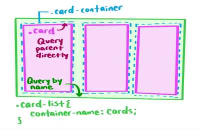
Component-specific styling? What has long sounded like a dream to any developer, is slowly but surely becoming reality. Thanks to container queries, we can now query the width and style of the container in which components live.

CSS Container Queries And Style Queries

Style queries give us more logical control of styles in CSS. (Large preview)

As Una Kravets points out in her introduction to style queries, this currently only works with CSS custom property values, but there are already some real-world use cases where style queries shine: They come in particularly handy when you have a reusable component with multiple variations or when you don’t have control over all of your styles but need to apply changes in certain cases.

If you want to dive deeper into what’s possible with container style queries and the things we can — maybe — look forward to in the future, also be sure to take a look at Geoff Graham’s post. He dug deep into the more nuanced aspects of style queries and summarized the things that stood out to him.

No More Typographic Orphans And Widows

We all know those headlines where the last word breaks onto a new line and stands there alone, breaking the visual and looking, well, odd. Of course, there’s the good ol’ <br> to break the text manually or a <span> to divide the content into different parts. But have you heard of text-wrap: balance already?

No More Typographic Orphans And Widows

No more odd line breaks, thanks to text-wrap: balance. (Large preview)

By applying the text-wrap: balance property, the browser will automatically calculate the number of words and divide them equally between two lines — perfect for page titles, card titles, tooltips, modals, and FAQs, for example. Ahmad Shadeed wrote a helpful guide to text-wrap: balance in which he takes a detailed look at the property and how it can help you make your headlines look more consistent.

When dealing with large blocks of text, such as paragraphs, you might want to look into text-wrap: pretty to prevent orphans on the last line.

Auto Field-Sizing For Forms

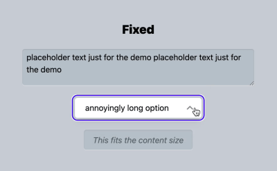
Finding just the right size for an input field usually involves a lot of guesswork — or JavaScript — to count characters and increase the field’s height or width as a user enters text. CSS field-sizing is here to change that. With field-sizing, we can auto-grow inputs and text areas, but also auto-shrink short select menus, so the form always fits content size perfectly. All we need to make it happen is one line of CSS.

Auto Field-Sizing For Forms

Auto field-sizing allows us to automatically grow or shrink inputs and text areas depending on the content size. (Large preview)

Adam Argyle summarized everything you need to know about field-sizing, exploring in detail how field-sizing affects different <form> elements. To prevent your input fields from becoming too small or too large, it is also a good idea to insert some additional styles that keep them in shape. Adam shares a code snippet that you can copy-and-paste right away.

Making Hidden Content Searchable

Accordions are a popular UI pattern, but they come with a caveat: The content inside the collapsed sections is impossible to search with find-in-page search. By using the hidden=until-found attribute and the beforematch event, we can solve the problem and even make the content accessible to search engines.

Making Hidden Content Searchable

hidden=until-found makes hidden content in accordions searchable. (Large preview)

As Joey Arhar explains in his guide to making collapsed content searchable, you can replace the styles that hide the section with the hidden=until-found attribute. If your page also has another state that needs to be kept in sync with whether or not your section is revealed, he recommends adding a beforematch event listener. It will be fired on the hidden=until-found element right before the element is revealed by the browser.

Styling Groups Within Select Menus

It’s a small upgrade for the <select> element, but a mighty one: We can now add <hr> into the list of select options, and they will appear as separators to help visually break up the options in the list.

Styling Groups Within Select Menus

Perfect when your select menu has a lot of options: It’s now possible to group content. (Large preview)

If you want to refine things further, also be sure to take a look at <optgroup>. The HTML element lets you group options within a <select> element by adding a subheading for each group.

Simpler Snapping For Scrollable Containers

Sometimes, you need a quick and easy way to make an element a scrollable container. CSS scroll snap makes it possible. The CSS feature enables us to create a well-controlled scrolling experience that lets users precisely swipe left and right and snap to a specific item in the container. No JavaScript required.

Simpler Snapping For Scalable Containers

Have you ever wished there was a CSS feature that makes it easy to create a scrollable container? CSS scroll snap is here to help. (Large preview)

Ahmad Shadeed wrote a practical guide that walks you step by step through the process of setting up a container with scroll snap. You can use it to create image galleries, avatar lists, or other components where you want a user to scroll and snap through the content, whether it’s horizontally or vertically.

Anchor Positioning For Tooltips And Popovers

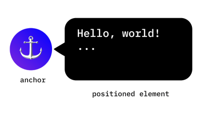
Whether you use it for footnotes, tooltips, connector lines, visual cross-referencing, or dynamic labels in charts, the CSS Anchor Positioning API enables us to natively position elements relative to other elements, known as anchors.

Anchor Positioning For Tooltips And Popovers

The CSS Anchor Positioning API helps us create layered interfaces without any third-party libraries. (Large preview)

In her introduction to the CSS Anchor Positioning API, Una Kravets summarized in detail how anchor positioning works. She takes a closer look at the mechanism behind anchor positioning, how to tether to one and multiple anchors, and how to size and position an anchor-positioned element based on the size of its anchor. Browser support is still limited, so you might want to use the API with some precautions. Una’s guide includes what to watch out for.

High-Definition Colors With OKLCH And OKLAB

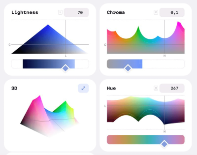
With high-definition colors with LCH, okLCH, LAB, and okLAB that give us access to 50% more colors, the times of RGB/HSL might be over soon. To get you familiar with the new color spaces, Vitaly wrote a quick overview of what you need to know.

High-Definition Colors With OKLCH And OKLAB

The times of RGB/HSL might be over soon. Say hello to high-definition colors. (Large preview)

Both OKLCH and OKLAB are based on human perception and can specify any color the human eye can see. While OKLAB works best for rich gradients, OKLCH is a fantastic fit for color palettes in design systems. OKLCH/OKLAB colors are fully supported in Chrome, Edge, Safari, Firefox, and Opera. Figma doesn’t support them yet.

Relative Colors In CSS

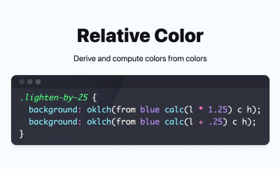
Let’s say you have a background color and want to reduce its luminosity by 25%, or you want to use a complementary color without having to calculate it yourself. The relative color syntax (RCS) makes it possible to create a new color based on a given color.

Relative Colors In CSS

Relative colors allow us to automatically calculate a new color based on an existing color. (Large preview)

To derive and compute a new color, we can use the from keyword for color functions (color(), hsl(), oklch(), etc.) to modify the values of the input color. Adam Argyle shares some code snippets of what this looks like in practice, or check the spec for more details.

Smooth Transitions With The View Transitions API

There are a number of use cases where a smooth visual transition can make the user experience more engaging. When a thumbnail image on a product listing page transitions into a full-size image on the product detail page, for example, or when you have a fixed navigation bar that stays in place as you navigate from one page to another. The View Transitions API helps us create seamless visual transitions between different views on a site.

Smooth Transitions With The View Transitions API

The View Transitions API creates seamless visual transitions between different views. (Large preview)

View transitions can be triggered not only on a single document but also between two different documents. Both rely on the same principle: The browser takes snapshots of the old and new states, the DOM gets updated while rendering is suppressed, and the transitions are powered by CSS Animations. The only difference lies in how you trigger them, as Bramus Van Damme explains in his guide to the View Transitions API. A good alternative to single page apps that often rely on heavy JavaScript frameworks.

Exclusive Accordions

The ‘exclusive accordion’ is a variation of the accordion component. It only allows one disclosure widget to be open at the same time, so when a user opens a new one, the one that is already open will be closed automatically to save space. Thanks to CSS, we can now create the effect without a single line of JavaScript.

Exclusive Accordions

An exclusive accordion automatically closes a disclosure widget when a new one is opened. (Large preview)

To build an exclusive accordion, we need to add a name attribute to the <details> elements. When this attribute is used, all <details> elements that have the same name value form a semantic group and behave as an exclusive accordion. Bramus Van Damme summarized in detail how it works.

Live And Late Validation

When we use :valid and :invalid to apply styling based on a user’s input, there’s a downside: a form control that is required and empty will match :invalid even if a user hasn’t started interacting with it yet. To prevent this from happening, we usually had to write stateful code that keeps track of input a user has changed. But not anymore.

Live And Late Validation

:user-valid and :user-invalid improve the user experience of input validation. (Large preview)

With :user-valid and :user-invalid, we now have a native CSS solution that handles all of this automatically. Contrary to :valid and :invalid, the :user-valid and :user-invalid pseudo-classes give users feedback about mistakes only after they have changed the input. :user-valid and :user-invalid work with input, select, and textarea controls.

Smooth Scrolling Behavior

Imagine you have a scrolling box and a series of links that target an anchored position inside the box. When a user clicks on one of the links, it will take them to the content section inside the scrolling box — with a rather abrupt jump. The scroll-behavior property makes the scrolling transition a lot smoother, only with CSS.

Smooth Scrolling Behavior

scroll-behavior sets the behavior for a scrolling box when scrolling is triggered by the navigation. (Large preview)

When setting the scroll-behavior value to smooth, the scrolling box will scroll in a smooth fashion using a user-agent-defined easing function over a user-agent-defined period of time. Of course, you can also use scroll-behavior: auto, and the scrolling box will scroll instantly.

Making Focus Visible

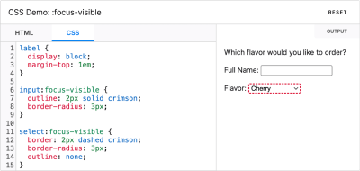
Focus styles are essential to help keyboard users navigate a page. However, for mouse users, it can be irritating when a focus ring appears around a button or link as they click on it. :focus-visible is here to help us create the best experience for both user groups: It displays focus styles for keyboard users and hides them for mouse users.

Making Focus Visible

:focus-visible shows focus styles only when necessary. (Large preview)

:focus-visible applies while an element matches the :focus pseudo-class and the User Agent determines via heuristics that the focus should be made visible on the element. Curious how it works in practice? MDN Web Docs highlights the differences between :focus and :focus-visible, what you need to consider accessibility-wise, and how to provide a fallback for old browser versions that don’t support :focus-visible.

Styling Parents Based On Children

Historically, CSS selectors have worked in a top-down fashion, allowing us to style a child based on its parent. The new CSS pseudo-class :has works the other way round: We can now style a parent based on its children. But that’s not all yet. Josh W. Comeau wrote a fantastic introduction to :has in which he explores real-world use cases that show what the pseudo-class is capable of.

Styling Parents Based On Children

:has makes it possible to style one element based on the property or status of any other element. (Large preview)

:has is not limited to parent-child relationships or direct siblings. Instead, it lets us style one element based on the properties or status of any other element in a totally different container. And it can be used as a sort of global event listener, as Josh shows — to disable scrolling on a page when a modal is open or to create a JavaScript-free dark mode toggle, for example.

Interpolate Between Values For Type And Spacing

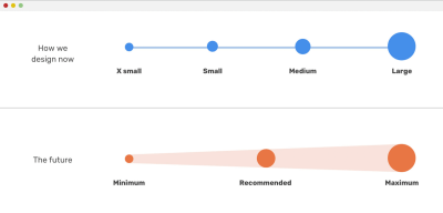
CSS comparison functions min(), max(), and clamp() are today supported in all major browsers, providing us with an effective way to create dynamic layouts with fluid type scales, grids, and spacing systems.

Interpolate Between Values For Type And Spacing

The future of design is fluid. (Large preview)

To get you fit for using the functions in your projects right away, Ahmad Shadeed wrote a comprehensive guide in which he explains everything you need to know about min(), max(), and clamp(), with practical examples and use cases and including all the points of confusion you might encounter.

If you’re looking for a quick and easy way to create fluid scales, the Fluid Type Scale Calculator by Utopia has got your back. All you need to do is define min and max viewport widths and the number of scale steps, and the calculator provides you with a responsive preview of the scale and the CSS code snippet.

Reliable Dialog And Popover

If you’re looking for a quick way to create a modal or popup, the <dialog> HTML element finally offers a native (and accessible!) solution to help you get the job done. It represents a modal or non-modal dialog box or other interactive component, such as a confirmation prompt or a subwindow used to enter data.

Reliable dialog And Popover

We now have accessible <dialog> menus for blocking pop-ups and popovers for non-blocking menus. (Large preview)

While modal dialog boxes interrupt interaction with a page, non-modal dialog boxes allow interaction with the page while the dialog is open. Adam Argyle published some code snippets that show how <dialog> can block pop-ups and popovers for non-blocking menus, out of the box.

Responsive HTML Video And Audio

In 2014, media attribute support for HTML video sources was deleted from the HTML standard. Last year, it made a comeback, which means that we can use media queries for delivering responsive HTML videos.

Responsive HTML Video And Audio

Adjusting video and audio files based on the browser’s viewport reduces page payload. (Large preview)

Scott Jehl summarized how responsive HTML video — and even audio — works, what you need to consider when writing the markup, and what other types of media queries can be used in combination with HTML video.

The Right Virtual Keyboard On Mobile

It’s a small detail, but one that adds to a well-considered user experience: displaying the most comfortable touchscreen keyboard to help a user enter their information without having to switch back and forth to insert numbers, punctuation, or special characters like an @ symbol.

Right Virtual Keyboards On Mobile

The right virtual keyboard improves the user experience for mobile users. (Large preview)

To show the right keyboard layout, we can use inputmode. It instructs the browser which keyboard to display and supports values for numeric, telephone, decimal, email, URL, and search keyboards. To further improve the UX, we can add the enterkeyhint attribute: it adjusts the text on the Enter key. If no enterkeyhint is used, the user agent might use contextual information from the inputmode attribute.

A Look Into The Future

As we are starting to adopt all of these shiny new front-end features in our projects, the web platform is, of course, constantly evolving — and there are some exciting things on the horizon already! For example, we are very close to getting masonry layout, fully customizable drop-downs with <selectmenu>, and text-box trimming for adjusting fonts to be perfectly aligned within the grid. Kudos to all the wonderful people who are working tirelessly to push the web forward! 👏

In the meantime, we hope you found something helpful in this post that you can apply to your product or application right away. Happy tinkering!

Smashing Weekly Newsletter

The weekly Smashing NewsletterYou want to stay on top of what’s happening in the world of front-end and UX? With our weekly newsletter, we aim to bring you useful, practical tidbits and share some of the helpful things that folks are working on in the web industry. Every issue is curated, written, and edited with love and care. No third-party mailings or hidden advertising.

Also, when you subscribe, you really help us pay the bills. Thank you for your kind support!

Smashing Editorial
(vf, il)
An Introduction To CSS Scroll-Driven Animations: Scroll And View Progress Timelines

An Introduction To CSS Scroll-Driven Animations: Scroll And View Progress Timelines

An Introduction To CSS Scroll-Driven Animations: Scroll And View Progress Timelines

Mariana Beldi

2024-12-11T15:00:00+00:00
2025-03-06T17:04:34+00:00

You can safely use scroll-driven animations in Chrome as of December 2024. Firefox supports them, too, though you’ll need to enable a flag. Safari? Not yet, but don’t worry — you can still offer a seamless experience across all browsers with a polyfill. Just keep in mind that adding a polyfill involves a JavaScript library, so you won’t get the same performance boost.

There are plenty of valuable resources to dive into scroll-driven animations, which I’ll be linking throughout the article. My starting point was Bramus’ video tutorial, which pairs nicely with Geoff’s in-depth notes Graham that build on the tutorial.

In this article, we’ll walk through the latest published version by the W3C and explore the two types of scroll-driven timelines — scroll progress timelines and view progress timelines. By the end, I hope that you are familiar with both timelines, not only being able to tell them apart but also feeling confident enough to use them in your work.

Note: All demos in this article only work in Chrome 116 or later at the time of writing.

Scroll Progress Timelines

The scroll progress timeline links an animation’s timeline to the scroll position of a scroll container along a specific axis. So, the animation is tied directly to scrolling. As you scroll forward, so does the animation. You’ll see me refer to them as scroll-timeline animations in addition to calling them scroll progress timelines.

Just as we have two types of scroll-driven animations, we have two types of scroll-timeline animations: anonymous timelines and named timelines.

Anonymous scroll-timeline

Let’s start with a classic example: creating a scroll progress bar at the top of a blog post to track your reading progress.

See the Pen [Scroll Progress Timeline example – before animation-timeline scroll() [forked]](https://codepen.io/smashingmag/pen/RNbRqoj) by Mariana Beldi.

See the Pen Scroll Progress Timeline example – before animation-timeline scroll() [forked] by Mariana Beldi.

In this example, there’s a <div> with the ID “progress.” At the end of the CSS file, you’ll see it has a background color, a defined width and height, and it’s fixed at the top of the page. There’s also an animation that scales it from 0 to 1 along the x-axis — pretty standard if you’re familiar with CSS animations!

Here’s the relevant part of the styles:

#progress {
  /* ... */
  animation: progressBar 1s linear;
}


@keyframes progressBar {
  from { transform: scaleX(0); }
}

The progressBar animation runs once and lasts one second with a linear timing function. Linking this animation scrolling is just a single line in CSS:

animation-timeline: scroll();

No need to specify seconds for the duration — the scrolling behavior itself will dictate the timing. And that’s it! You’ve just created your first scroll-driven animation! Notice how the animation’s direction is directly tied to the scrolling direction — scroll down, and the progress indicator grows wider; scroll up, and it becomes narrower.

See the Pen [Scroll Progress Timeline example – animation-timeline scroll() [forked]](https://codepen.io/smashingmag/pen/ByBzGpO) by Mariana Beldi.

See the Pen Scroll Progress Timeline example – animation-timeline scroll() [forked] by Mariana Beldi.

scroll-timeline Property Parameters

In a scroll-timeline animation, the scroll() function is used inside the animation-timeline property. It only takes two parameters: <scroller> and <axis>.

  • <scroller> refers to the scroll container, which can be set as nearest (the default), root, or self.
  • <axis> refers to the scroll axis, which can be block (the default), inline, x, or y.

In the reading progress example above, we didn’t declare any of these because we used the defaults. But we could achieve the same result with:

animation-timeline: scroll(nearest block);

Here, the nearest scroll container is the root scroll of the HTML element. So, we could also write it this way instead:

animation-timeline: scroll(root block);

The block axis confirms that the scroll moves top to bottom in a left-to-right writing mode. If the page has a wide horizontal scroll, and we want to animate along that axis, we could use the inline or x values (depending on whether we want the scrolling direction to always be left-to-right or adapt based on the writing mode).

We’ll dive into self and inline in more examples later, but the best way to learn is to play around with all the combinations, and this tool by Bramus lets you do exactly that. Spend a few minutes before we jump into the next property associated with scroll timelines.

The animation-range Property

The animation-range for scroll-timeline defines which part of the scrollable content controls the start and end of an animation’s progress based on the scroll position. It allows you to decide when the animation starts or ends while scrolling through the container.

By default, the animation-range is set to normal, which is shorthand for the following:

animation-range-start: normal;
animation-range-end: normal;

This translates to 0% (start) and 100% (end) in a scroll-timeline animation:

animation-range: normal normal;

…which is the same as:

animation-range: 0% 100%;

You can declare any CSS length units or even calculations. For example, let’s say I have a footer that’s 500px tall. It’s filled with banners, ads, and related posts. I don’t want the scroll progress bar to include any of that as part of the reading progress. What I want is for the animation to start at the top and end 500px before the bottom. Here we go:

animation-range: 0% calc(100% - 500px);

See the Pen [Scroll Progress Timeline example – animation-timeline, animation-range [forked]](https://codepen.io/smashingmag/pen/azoZQym) by Mariana Beldi.

See the Pen Scroll Progress Timeline example – animation-timeline, animation-range [forked] by Mariana Beldi.

Just like that, we’ve covered the key properties of scroll-timeline animations. Ready to take it a step further?

Named scroll-timeline

Let’s say I want to use the scroll position of a different scroll container for the same animation. The scroll-timeline-name property allows you to specify which scroll container the scroll animation should be linked to. You give it a name (a dashed-ident, e.g., --my-scroll-timeline) that maps to the scroll container you want to use. This container will then control the animation’s progress as the user scrolls through it.

Next, we need to define the scroll axis for this new container by using the scroll-timeline-axis, which tells the animation which axis will trigger the motion. Here’s how it looks in the code:

.my-class { 
  /* This is my new scroll-container */
  scroll-timeline-name: --my-custom-name;
  scroll-timeline-axis: inline;
}

If you omit the axis, then the default block value will be used. However, you can also use the shorthand scroll-timeline property to combine both the name and axis in a single declaration:

.my-class { 
  /* Shorthand for scroll-container with axis */
  scroll-timeline: --my-custom-name inline;
}

I think it’s easier to understand all this with a practical example. Here’s the same progress indicator we’ve been working with, but with inline scrolling (i.e., along the x-axis):

See the Pen [Named Scroll Progress Timeline [forked]](https://codepen.io/smashingmag/pen/pvzbQrM) by Mariana Beldi.

See the Pen Named Scroll Progress Timeline [forked] by Mariana Beldi.

We have two animations running:

  1. A progress bar grows wider when scrolling in an inline direction.
  2. The container’s background color changes the further you scroll.

The HTML structure looks like the following:

<div class="gallery">
  <div class="gallery-scroll-container">
    <div class="gallery-progress" role="progressbar" aria-label="progress"></div>
    <img src="image1.svg" alt="Alt text" draggable="false" width="500">
    <img src="image2.svg" alt="Alt text" draggable="false" width="500">
    <img src="image3.svg" alt="Alt text" draggable="false" width="500">
  </div>
</div>

In this case, the gallery-scroll-container has horizontal scrolling and changes its background color as you scroll. Normally, we could just use animation-timeline: scroll(self inline) to achieve this. However, we also want the gallery-progress element to use the same scroll for its animation.

The gallery-progress element is the first inside gallery-scroll-container, and we will lose it when scrolling unless it’s absolutely positioned. But when we do this, the element no longer occupies space in the normal document flow, and that affects how the element behaves with its parent and siblings. We need to specify which scroll container we want it to listen to.

That’s where naming the scroll container comes in handy. By giving gallery-scroll-container a scroll-timeline-name and scroll-timeline-axis, we can ensure both animations sync to the same scroll:

.gallery-scroll-container {
  /* ... */
  animation: bg steps(1);
  scroll-timeline: --scroller inline;
}

And is using that scrolling to define its own animation-timeline:

.gallery-scroll-container {
  /* ... */
  animation: bg steps(1);
  scroll-timeline: --scroller inline;
  animation-timeline: --scroller;
}

Now we can scale this name to the progress bar that is using a different animation but listening to the same scroll:

.gallery-progress {
  /* ... */
  animation: progressBar linear;
  animation-timeline: --scroller;
}

This allows both animations (the growing progress bar and changing background color) to follow the same scroll behavior, even though they are separate elements and animations.

The timeline-scope Property

What happens if we want to animate something based on the scroll position of a sibling or even a higher ancestor? This is where the timeline-scope property comes into play. It allows us to extend the scope of a scroll-timeline beyond the current element’s subtree. The value of timeline-scope must be a custom identifier, which again is a dashed-ident.

Let’s illustrate this with a new example. This time, scrolling in one container runs an animation inside another container:

See the Pen [Scroll Driven Animations – timeline-scope [forked]](https://codepen.io/smashingmag/pen/jENrQGo) by Mariana Beldi.

See the Pen Scroll Driven Animations – timeline-scope [forked] by Mariana Beldi.

We can play the animation on the image when scrolling the text container because they are siblings in the HTML structure:

<div class="main-container">
  <div class="sardinas-container">
    <img ...>
  </div>

  <div class="scroll-container">
    <p>Long text...</p>
  </div>
</div>

Here, only the .scroll-container has scrollable content, so let’s start by naming this:

.scroll-container {
  /* ... */
  overflow-y: scroll;
  scroll-timeline: --containerText;
}

Notice that I haven’t specified the scroll axis, as it defaults to block (vertical scrolling), and that’s the value I want.

Let’s move on to the image inside the sardinas-container. We want this image to animate as we scroll through the scroll-container. I’ve added a scroll-timeline-name to its animation-timeline property:

.sardinas-container img {
  /* ... */
  animation: moveUp steps(6) both;
  animation-timeline: --containerText;
}

At this point, however, the animation still won’t work because the scroll-container is not directly related to the images. To make this work, we need to extend the scroll-timeline-name so it becomes reachable. This is done by adding the timeline-scope to the parent element (or a higher ancestor) shared by both elements:

.main-container {
  /* ... */
  timeline-scope: --containerText;
}

With this setup, the scroll of the scroll-container will now control the animation of the image inside the sardinas-container!

Now that we’ve covered how to use timeline-scope, we’re ready to move on to the next type of scroll-driven animations, where the same properties will apply but with slight differences in how they behave.

View Progress Timelines

We just looked at scroll progress animations. That’s the first type of scroll-driven animation of the two. Next, we’re turning our attention to view progress animations. There’s a lot of similarities between the two! But they’re different enough to warrant their own section for us to explore how they work. You’ll see me refer to these as view-timeline animations in addition to calling them view progress animations, as they revolve around a view() function.

The view progress timeline is the second type of type of scroll-driven animation that we’re looking at. It tracks an element as it enters or exits the scrollport (the visible area of the scrollable content). This behavior is quite similar to how an IntersectionObserver works in JavaScript but can be done entirely in CSS.

We have anonymous and named view progress timelines, just as we have anonymous and named scroll progress animations. Let’s unpack those.

Anonymous View Timeline

Here’s a simple example to help us see the basic idea of anonymous view timelines. Notice how the image fades into view when you scroll down to a certain point on the page:

See the Pen [View Timeline Animation – view() [forked]](https://codepen.io/smashingmag/pen/KwPMrQO) by Mariana Beldi.

See the Pen View Timeline Animation – view() [forked] by Mariana Beldi.

Let’s say we want to animate an image that fades in as it appears in the scrollport. The image’s opacity will go from 0 to 1. This is how you might write that same animation in classic CSS using @keyframes:

img {
  /* ... */
  animation: fadeIn 1s;
}

@keyframes fadeIn {
  from { opacity: 0; }
  to { opacity: 1; }
}

That’s great, but we want the image to fadeIn when it’s in view. Otherwise, the animation is sort of like a tree that falls in a forest with no one there to witness it… did the animation ever happen? We’ll never know!

We have a view() function that makes this a view progress animation with a single line of CSS:

img {
  /* ... */
  animation: fadeIn;
  animation-timeline: view();
}

And notice how we no longer need to declare an animation-duration like we did in classic CSS. The animation is no longer tied by time but by space. The animation is triggered as the image becomes visible in the scrollport.

View Timeline Parameters

Just like the scroll-timeline property, the view-timeline property accepts parameters that allow for more customization:

animation-timeline: view( );
  • <inset>
    Controls when the animation starts and ends relative to the element’s visibility within the scrollport. It defines the margin between the edges of the scrollport and the element being tracked. The default value is auto, but it can also take length percentages as well as start and end values.
  • <axis>
    This is similar to the scroll-timeline’s axis parameter. It defines which axis (horizontal or vertical) the animation is tied to. The default is block, which means it tracks the vertical movement. You can also use inline to track horizontal movement or simple x or y.

Here’s an example that uses both inset and axis to customize when and how the animation starts:

img {
  animation-timeline: view(20% block);
}

In this case:

  1. The animation starts when the image is 20% visible in the scrollport.
  2. The animation is triggered by vertical scrolling (block axis).

Parallax Effect

With the view() function, it’s also easy to create parallax effects by simply adjusting the animation properties. For example, you can have an element move or scale as it enters the scrollport without any JavaScript:

img {
  animation: parallaxMove 1s;
  animation-timeline: view();
}

@keyframes parallaxMove {
  to { transform: translateY(-50px); }
}

This makes it incredibly simple to create dynamic and engaging scroll animations with just a few lines of CSS.

See the Pen [Parallax effect with CSS Scroll driven animations – view() [forked]](https://codepen.io/smashingmag/pen/mybEQLK) by Mariana Beldi.

See the Pen Parallax effect with CSS Scroll driven animations – view() [forked] by Mariana Beldi.

The animation-range Property

Using the CSS animation-range property with view timelines defines how much of an element’s visibility within the scrollport controls the start and end points of the animation’s progress. This can be used to fine-tune when the animation begins and ends based on the element’s visibility in the viewport.

While the default value is normal, in view timelines, it translates to tracking the full visibility of the element from the moment it starts entering the scrollport until it fully leaves. This is represented by the following:

animation-range: normal normal;
/* Equivalent to */
animation-range: cover 0% cover 100%;

Or, more simply:

animation-range: cover;

There are six possible values or timeline-range-names:

  1. cover
    Tracks the full visibility of the element, from when it starts entering the scrollport to when it completely leaves it.
  2. contain
    Tracks when the element is fully visible inside the scrollport, from the moment it’s fully contained until it no longer is.
  3. entry
    Tracks the element from the point it starts entering the scrollport until it’s fully inside.
  4. exit
    Tracks the element from the point it starts, leaving the scrollport until it’s fully outside.
  5. entry-crossing
    Tracks the element as it crosses the starting edge of the scrollport, from start to full crossing.
  6. exit-crossing
    Tracks the element as it crosses the end edge of the scrollport, from start to full crossing.

You can mix different timeline-range-names to control the start and end points of the animation range. For example, you could make the animation start when the element enters the scrollport and end when it exits:

animation-range: entry exit;

You can also combine these values with percentages to define more custom behavior, such as starting the animation halfway through the element’s entry and ending it halfway through its exit:

animation-range: entry 50% exit 50%;

Exploring all these values and combinations is best done interactively. Tools like Bramus’ view-timeline range visualizer make it easier to understand.

Target Range Inside @keyframes

One of the powerful features of timeline-range-names is their ability to be used inside @keyframes:

See the Pen [target range inside @keyframes – view-timeline, timeline-range-name [forked]](https://codepen.io/smashingmag/pen/zxOBMaK) by Mariana Beldi.

See the Pen target range inside @keyframes – view-timeline, timeline-range-name [forked] by Mariana Beldi.

Two different animations are happening in that demo:

  1. slideIn
    When the element enters the scrollport, it scales up and becomes visible.
  2. slideOut
    When the element leaves, it scales down and fades out.
@keyframes slideIn {
  from {
    transform: scale(.8) translateY(100px); 
    opacity: 0;
  }
  to { 
    transform: scale(1) translateY(0); 
    opacity: 1;
  }
}

@keyframes slideOut {
  from {
    transform: scale(1) translateY(0); 
    opacity: 1;    
  }
  to { 
    transform: scale(.8) translateY(-100px); 
    opacity: 0 
  }
}

The new thing is that now we can merge these two animations using the entry and exit timeline-range-names, simplifying it into one animation that handles both cases:

@keyframes slideInOut {
  /* Animation for when the element enters the scrollport */
  entry 0% {
    transform: scale(.8) translateY(100px); 
    opacity: 0;
  }
  entry 100% { 
    transform: scale(1) translateY(0); 
    opacity: 1;
  }
  /* Animation for when the element exits the scrollport */
  exit 0% {
    transform: scale(1) translateY(0); 
    opacity: 1;    
  }
  exit 100% { 
    transform: scale(.8) translateY(-100px); 
    opacity: 0;
  }
}
  • entry 0%
    Defines the state of the element at the beginning of its entry into the scrollport (scaled down and transparent).
  • entry 100%
    Defines the state when the element has fully entered the scrollport (fully visible and scaled up).
  • exit 0%
    Starts tracking the element as it begins to leave the scrollport (visible and scaled up).
  • exit 100%
    Defines the state when the element has fully left the scrollport (scaled down and transparent).

This approach allows us to animate the element’s behavior smoothly as it both enters and leaves the scrollport, all within a single @keyframes block.

Named view-timeline And timeline-scope

The concept of using view-timeline with named timelines and linking them across different elements can truly expand the possibilities for scroll-driven animations. In this case, we are linking the scroll-driven animation of images with the animations of unrelated paragraphs in the DOM structure by using a named view-timeline and timeline-scope.

The view-timeline property works similarly to the scroll-timeline property. It’s the shorthand for declaring the view-timeline-name and view-timeline-axis properties in one line. However, the difference from scroll-timeline is that we can link the animation of an element when the linked elements enter the scrollport. I took the previous demo and added an animation to the paragraphs so you can see how the opacity of the text is animated when scrolling the images on the left:

See the Pen [View-timeline, timeline-scope [forked]](https://codepen.io/smashingmag/pen/KwPMrBP) by Mariana Beldi.

See the Pen View-timeline, timeline-scope [forked] by Mariana Beldi.

This one looks a bit verbose, but I found it hard to come up with a better example to show the power of it. Each image in the vertical scroll container is assigned a named view-timeline with a unique identifier:

.vertical-scroll-container img:nth-of-type(1) { view-timeline: --one; }
.vertical-scroll-container img:nth-of-type(2) { view-timeline: --two; }
.vertical-scroll-container img:nth-of-type(3) { view-timeline: --three; }
.vertical-scroll-container img:nth-of-type(4) { view-timeline: --four; }

This makes the scroll timeline of each image have its own custom name, such as --one for the first image, --two for the second, and so on.

Next, we connect the animations of the paragraphs to the named timelines of the images. The corresponding paragraph should animate when the images enter the scrollport:

.vertical-text p:nth-of-type(1) { animation-timeline: --one; }
.vertical-text p:nth-of-type(2) { animation-timeline: --two; }
.vertical-text p:nth-of-type(3) { animation-timeline: --three; }
.vertical-text p:nth-of-type(4) { animation-timeline: --four; }

However, since the images and paragraphs are not directly related in the DOM, we need to declare a timeline-scope on their common ancestor. This ensures that the named timelines (--one, --two, and so on) can be referenced and shared between the elements:

.porto {
  /* ... */
  timeline-scope: --one, --two, --three, --four;
}

By declaring the timeline-scope with all the named timelines (--one, —two, --three, --four), both the images and the paragraphs can participate in the same scroll-timeline logic, despite being in separate parts of the DOM tree.

Final Notes

We’ve covered the vast majority of what’s currently defined in the CSS Scroll-Driven Animations Module Leve 1 specification today in December 2024. But I want to highlight a few key takeaways that helped me better understand these new rules that you may not get directly from the spec:

  • Scroll container essentials
    It may seem obvious, but a scroll container is necessary for scroll-driven animations to work. Issues often arise when elements like text or containers are resized or when animations are tested on larger screens, causing the scrollable area to disappear.
  • Impact of position: absolute
    Using absolute positioning can sometimes interfere with the intended behavior of scroll-driven animations. The relationship between elements and their parent elements gets tricky when position: absolute is applied.
  • Tracking an element’s initial state
    The browser evaluates the element’s state before any transformations (like translate) are applied. This affects when animations, particularly view timelines, begin. Your animation might trigger earlier or later than expected due to the initial state.
  • Avoid hiding overflow
    Using overflow: hidden can disrupt the scroll-seeking mechanism in scroll-driven animations. The recommended solution is to switch to overflow: clip. Bramus has a great article about this and a video from Kevin Powell also suggests that we may no longer need overflow: hidden.
  • Performance
    For the best results, stick to animating GPU-friendly properties like transforms, opacity, and some filters. These skip the heavy lifting of recalculating layout and repainting. On the other hand, animating things like width, height, or box-shadow can slow things down since they require re-rendering. Bramus mentioned that soon, more properties — like background-color, clip-path, width, and height — will be animatable on the compositor, making the performance even better.
  • Use will-change wisely
    Leverage this property to promote elements to the GPU, but use it sparingly. Overusing will-change can lead to excessive memory usage since the browser reserves resources even if the animations don’t frequently change.
  • The order matters
    If you are using the animation shorthand, always place the animation-timeline after it.
  • Progressive enhancement and accessibility
    Combine media queries for reduced motion preferences with the @supports rule to ensure animations only apply when the user has no motion restrictions, and the browser supports them.

For example:

@media screen and (prefers-reduce-motion: no-preference) {
  @supports ((animation-timeline: scroll()) and (animation-range: 0% 100%)) { 
    .my-class {
      animation: moveCard linear both;    
      animation-timeline: view(); 
    }
  } 
}

My main struggle while trying to build the demos was more about CSS itself than the scroll animations. Sometimes, building the layout and generating the scroll was more difficult than applying the scroll animation. Also, some things that confused me at the beginning as the spec keeps evolving, and some of these are not there anymore (remember, it has been under development for more than five years now!):

  • x and y axes
    These used to be called the “horizontal” and “vertical” axes, and while Firefox may still support the old terminology, it has been updated.
  • Old @scroll-timeline syntax
    In the past, @scroll-timeline was used to declare scroll timelines, but this has changed in the most recent version of the spec.
  • Scroll-driven vs. scroll-linked animations
    Scroll-driven animations were originally called scroll-linked animations. If you come across this older term in articles, double-check whether the content has been updated to reflect the latest spec, particularly with features like timeline-scope.

Resources

Smashing Editorial
(gg, yk)

CSS min() All The Things

CSS min() All The Things

CSS min() All The Things

Victor Ayomipo

2024-10-17T10:00:00+00:00
2025-03-06T17:04:34+00:00

Did you see this post that Chris Coyier published back in August? He experimented with CSS container query units, going all in and using them for every single numeric value in a demo he put together. And the result was… not too bad, actually.

See the Pen [Container Units for All Units [forked]](https://codepen.io/smashingmag/pen/ExqWXOQ) by Chris Coyier.

See the Pen Container Units for All Units [forked] by Chris Coyier.

What I found interesting about this is how it demonstrates the complexity of sizing things. We’re constrained to absolute and relative units in CSS, so we’re either stuck at a specific size (e.g., px) or computing the size based on sizing declared on another element (e.g., %, em, rem, vw, vh, and so on). Both come with compromises, so it’s not like there is a “correct” way to go about things — it’s about the element’s context — and leaning heavily in any one direction doesn’t remedy that.

I thought I’d try my own experiment but with the CSS min() function instead of container query units. Why? Well, first off, we can supply the function with any type of length unit we want, which makes the approach a little more flexible than working with one type of unit. But the real reason I wanted to do this is personal interest more than anything else.

The Demo

I won’t make you wait for the end to see how my min() experiment went:

We’ll talk about that more after we walk through the details.

A Little About min()

The min() function takes two values and applies the smallest one, whichever one happens to be in the element’s context. For example, we can say we want an element to be as wide as 50% of whatever container it is in. And if 50% is greater than, say 200px, cap the width there instead.

See the Pen [[forked]](https://codepen.io/smashingmag/pen/LYwWLMg) by Geoff Graham.

See the Pen [forked] by Geoff Graham.

So, min() is sort of like container query units in the sense that it is aware of how much available space it has in its container. But it’s different in that min() isn’t querying its container dimensions to compute the final value. We supply it with two acceptable lengths, and it determines which is best given the context. That makes min() (and max() for that matter) a useful tool for responsive layouts that adapt to the viewport’s size. It uses conditional logic to determine the “best” match, which means it can help adapt layouts without needing to reach for CSS media queries.

.element {
  width: min(200px, 50%);
}

/* Close to this: */
.element {
  width: 200px;

  @media (min-width: 600px) {
    width: 50%;
  }
}

The difference between min() and @media in that example is that we’re telling the browser to set the element’s width to 50% at a specific breakpoint of 600px. With min(), it switches things up automatically as the amount of available space changes, whatever viewport size that happens to be.

When I use the min(), I think of it as having the ability to make smart decisions based on context. We don’t have to do the thinking or calculations to determine which value is used. However, using min() coupled with just any CSS unit isn’t enough. For instance, relative units work better for responsiveness than absolute units. You might even think of min() as setting a maximum value in that it never goes below the first value but also caps itself at the second value.

I mentioned earlier that we could use any type of unit in min(). Let’s take the same approach that Chris did and lean heavily into a type of unit to see how min() behaves when it is used exclusively for a responsive layout. Specifically, we’ll use viewport units as they are directly relative to the size of the viewport.

Now, there are different flavors of viewport units. We can use the viewport’s width (vw) and height (vh). We also have the vmin and vmax units that are slightly more intelligent in that they evaluate an element’s width and height and apply either the smaller (vmin) or larger (vmax) of the two. So, if we declare 100vmax on an element, and that element is 500px wide by 250px tall, the unit computes to 500px.

That is how I am approaching this experiment. What happens if we eschew media queries in favor of only using min() to establish a responsive layout and lean into viewport units to make it happen? We’ll take it one piece at a time.

Font Sizing

There are various approaches for responsive type. Media queries are quickly becoming the “old school” way of doing it:

p { font-size: 1.1rem; }

@media (min-width: 1200px) {
  p { font-size: 1.2rem; }
}

@media (max-width: 350px) {
  p { font-size: 0.9rem; }
}

Sure, this works, but what happens when the user uses a 4K monitor? Or a foldable phone? There are other tried and true approaches; in fact, clamp() is the prevailing go-to. But we’re leaning all-in on min(). As it happens, just one line of code is all we need to wipe out all of those media queries, substantially reducing our code:

p { font-size: min(6vmin, calc(1rem + 0.23vmax)); }

I’ll walk you through those values…

  1. 6vmin is essentially 6% of the browser’s width or height, whichever is smallest. This allows the font size to shrink as much as needed for smaller contexts.
  2. For calc(1rem + 0.23vmax), 1rem is the base font size, and 0.23vmax is a tiny fraction of the viewport‘s width or height, whichever happens to be the largest.
  3. The calc() function adds those two values together. Since 0.23vmax is evaluated differently depending on which viewport edge is the largest, it’s crucial when it comes to scaling the font size between the two arguments. I’ve tweaked it into something that scales gradually one way or the other rather than blowing things up as the viewport size increases.
  4. Finally, the min() returns the smallest value suitable for the font size of the current screen size.

And speaking of how flexible the min() approach is, it can restrict how far the text grows. For example, we can cap this at a maximum font-size equal to 2rem as a third function parameter:

p { font-size: min(6vmin, calc(1rem + 0.23vmax), 2rem); }

This isn’t a silver bullet tactic. I’d say it’s probably best used for body text, like paragraphs. We might want to adjust things a smidge for headings, e.g., <h1>:

h1 { font-size: min(7.5vmin, calc(2rem + 1.2vmax)); }

We’ve bumped up the minimum size from 6vmin to 7.5vmin so that it stays larger than the body text at any viewport size. Also, in the calc(), the base size is now 2rem, which is smaller than the default UA styles for <h1>. We’re using 1.2vmax as the multiplier this time, meaning it grows more than the body text, which is multiplied by a smaller value, .023vmax.

This works for me. You can always tweak these values and see which works best for your use. Whatever the case, the font-size for this experiment is completely fluid and completely based on the min() function, adhering to my self-imposed constraint.

Margin And Padding

Spacing is a big part of layout, responsive or not. We need margin and padding to properly situate elements alongside other elements and give them breathing room, both inside and outside their box.

We’re going all-in with min() for this, too. We could use absolute units, like pixels, but those aren’t exactly responsive.

min() can combine relative and absolute units so they are more effective. Let’s pair vmin with px this time:

div { margin: min(10vmin, 30px); }

10vmin is likely to be smaller than 30px when viewed on a small viewport. That’s why I’m allowing the margin to shrink dynamically this time around. As the viewport size increases, whereby 10vmin exceeds 30px, min() caps the value at 30px, going no higher than that.

Notice, too, that I didn’t reach for calc() this time. Margins don’t really need to grow indefinitely with screen size, as too much spacing between containers or elements generally looks awkward on larger screens. This concept also works extremely well for padding, but we don’t have to go there. Instead, it might be better to stick with a single unit, preferably em, since it is relative to the element’s font-size. We can essentially “pass” the work that min() is doing on the font-size to the margin and padding properties because of that.

.card-info {
  font-size: min(6vmin, calc(1rem + 0.12vmax));
  padding: 1.2em;
}

Now, padding scales with the font-size, which is powered by min().

Widths

Setting width for a responsive design doesn’t have to be complicated, right? We could simply use a single percentage or viewport unit value to specify how much available horizontal space we want to take up, and the element will adjust accordingly. Though, container query units could be a happy path outside of this experiment.

But we’re min() all the way!

min() comes in handy when setting constraints on how much an element responds to changes. We can set an upper limit of 650px and, if the computed width tries to go larger, have the element settle at a full width of 100%:

.container { width: min(100%, 650px); }

Things get interesting with text width. When the width of a text box is too long, it becomes uncomfortable to read through the texts. There are competing theories about how many characters per line of text is best for an optimal reading experience. For the sake of argument, let’s say that number should be between 50-75 characters. In other words, we ought to pack no more than 75 characters on a line, and we can do that with the ch unit, which is based on the 0 character’s size for whatever font is in use.

p {
  width: min(100%, 75ch);
}

This code basically says: get as wide as needed but never wider than 75 characters.

Sizing Recipes Based On min()

Over time, with a lot of tweaking and modifying of values, I have drafted a list of pre-defined values that I find work well for responsively styling different properties:

:root {
  --font-size-6x: min(7.5vmin, calc(2rem + 1.2vmax));
  --font-size-5x: min(6.5vmin, calc(1.1rem + 1.2vmax));
  --font-size-4x: min(4vmin, calc(0.8rem + 1.2vmax));
  --font-size-3x: min(6vmin, calc(1rem + 0.12vmax));
  --font-size-2x: min(4vmin, calc(0.85rem + 0.12vmax));
  --font-size-1x: min(2vmin, calc(0.65rem + 0.12vmax));
  --width-2x: min(100vw, 1300px);
  --width-1x: min(100%, 1200px);
  --gap-3x: min(5vmin, 1.5rem);
  --gap-2x: min(4.5vmin, 1rem);
  --size-10x: min(15vmin, 5.5rem);
  --size-9x: min(10vmin, 5rem);
  --size-8x: min(10vmin, 4rem);
  --size-7x: min(10vmin, 3rem);
  --size-6x: min(8.5vmin, 2.5rem);
  --size-5x: min(8vmin, 2rem);
  --size-4x: min(8vmin, 1.5rem);
  --size-3x: min(7vmin, 1rem);
  --size-2x: min(5vmin, 1rem);
  --size-1x: min(2.5vmin, 0.5rem);
}

This is how I approached my experiment because it helps me know what to reach for in a given situation:

h1 { font-size: var(--font-size-6x); }

.container {
  width: var(--width-2x);
  margin: var(--size-2x);
}

.card-grid { gap: var(--gap-3x); }

There we go! We have a heading that scales flawlessly, a container that’s responsive and never too wide, and a grid with dynamic spacing — all without a single media query. The --size- properties declared in the variable list are the most versatile, as they can be used for properties that require scaling, e.g., margins, paddings, and so on.

The Final Result, Again

I shared a video of the result, but here’s a link to the demo.

See the Pen [min() website [forked]](https://codepen.io/smashingmag/pen/wvVdPxL) by Vayo.

See the Pen min() website [forked] by Vayo.

So, is min() the be-all, end-all for responsiveness? Absolutely not. Neither is a diet consisting entirely of container query units. I mean, it’s cool that we can scale an entire webpage like this, but the web is never a one-size-fits-all beanie.

If anything, I think this and what Chris demoed are warnings against dogmatic approaches to web design as a whole, not solely unique to responsive design. CSS features, including length units and functions, are tools in a larger virtual toolshed. Rather than getting too cozy with one feature or technique, explore the shed because you might find a better tool for the job.

Smashing Editorial
(gg, yk)
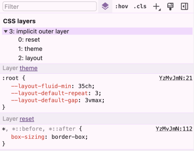
Sticky Headers And Full-Height Elements: A Tricky Combination

Sticky Headers And Full-Height Elements: A Tricky Combination

Sticky Headers And Full-Height Elements: A Tricky Combination

Philip Braunen

2024-09-05T09:00:00+00:00
2025-03-06T17:04:34+00:00

I was recently asked by a student to help with a seemingly simple problem. She’d been working on a website for a coffee shop that sports a sticky header, and she wanted the hero section right underneath that header to span the rest of the available vertical space in the viewport.

Here’s a visual demo of the desired effect for clarity.

Looks like it should be easy enough, right? I was sure (read: overconfident) that the problem would only take a couple of minutes to solve, only to find it was a much deeper well than I’d assumed.

Before we dive in, let’s take a quick look at the initial markup and CSS to see what we’re working with:

<body>
  <header class="header">Header Content</header>
  <section class="hero">Hero Content</section>
  <main class="main">Main Content</main>
</body>
.header {
  position: sticky;
  top: 0; /* Offset, otherwise it won't stick! */
}

/* etc. */

With those declarations, the .header will stick to the top of the page. And yet the .hero element below it remains intrinsically sized. This is what we want to change.

The Low-Hanging Fruit

The first impulse you might have, as I did, is to enclose the header and hero in some sort of parent container and give that container 100vh to make it span the viewport. After that, we could use Flexbox to distribute the children and make the hero grow to fill the remaining space.

<body>
  <div class="container">
    <header class="header">Header Content</header>
    <section class="hero">Hero Content</section>
  </div>
  <main class="main">Main Content</main>
</body>
.container {
  height: 100vh;
  display: flex;
  flex-direction: column;
}

.hero {
  flex-grow: 1;
}

/* etc. */

This looks correct at first glance, but watch what happens when scrolling past the hero.

See the Pen [Attempt #1: Container + Flexbox [forked]](https://codepen.io/smashingmag/pen/yLdQgQo) by Philip.

See the Pen Attempt #1: Container + Flexbox [forked] by Philip.

The sticky header gets trapped in its parent container! But.. why?

If you’re anything like me, this behavior is unintuitive, at least initially. You may have heard that sticky is a combination of relative and fixed positioning, meaning it participates in the normal flow of the document but only until it hits the edges of its scrolling container, at which point it becomes fixed. While viewing sticky as a combination of other values can be a useful mnemonic, it fails to capture one important difference between sticky and fixed elements:

A position: fixed element doesn’t care about the parent it’s nested in or any of its ancestors. It will break out of the normal flow of the document and place itself directly offset from the viewport, as though glued in place a certain distance from the edge of the screen.

Conversely, a position: sticky element will be pushed along with the edges of the viewport (or next closest scrolling container), but it will never escape the boundaries of its direct parent. Well, at least if you don’t count visually transform-ing it. So a better way to think about it might be, to steal from Chris Coyier, that position: sticky is, in a sense, a locally scoped position: fixed.” This is an intentional design decision, one that allows for section-specific sticky headers like the ones made famous by alphabetical lists in mobile interfaces.

See the Pen [Sticky Section Headers [forked]](https://codepen.io/smashingmag/pen/OJeaWrM) by Philip.

See the Pen Sticky Section Headers [forked] by Philip.

Okay, so this approach is a no-go for our predicament. We need to find a solution that doesn’t involve a container around the header.

Fixed, But Not Solved

Maybe we can make our lives a bit simpler. Instead of a container, what if we gave the .header element a fixed height of, say, 150px? Then, all we have to do is define the .hero element’s height as height: calc(100vh - 150px).

See the Pen [Attempt #2: Fixed Height + Calc() [forked]](https://codepen.io/smashingmag/pen/yLdQgGz) by Philip.

See the Pen Attempt #2: Fixed Height + Calc() [forked] by Philip.

This approach kinda works, but the downsides are more insidious than our last attempt because they may not be immediately apparent. You probably noticed that the header is too tall, and we’d wanna do some math to decide on a better height.

Thinking ahead a bit,

  • What if the .header’s children need to wrap or rearrange themselves at different screen sizes or grow to maintain legibility on mobile?
  • What if JavaScript is manipulating the contents?

All of these things could subtly change the .header’s ideal size, and chasing the right height values for each scenario has the potential to spiral into a maintenance nightmare of unmanageable breakpoints and magic numbers — especially if we consider this needs to be done not only for the .header but also the .hero element that depends on it.

I would argue that this workaround also just feels wrong. Fixed heights break one of the main affordances of CSS layout — the way elements automatically grow and shrink to adapt to their contents — and not relying on this usually makes our lives harder, not simpler.

So, we’re left with…

A Novel Approach

Now that we’ve figured out the constraints we’re working with, another way to phrase the problem is that we want the .header and .hero to collectively span 100vh without sizing the elements explicitly or wrapping them in a container. Ideally, we’d find something that already is 100vh and align them to that. This is where it dawned on me that display: grid may provide just what we need!

Let’s try this: We declare display: grid on the body element and add another element before the .header that we’ll call .above-the-fold-spacer. This new element gets a height of 100vh and spans the grid’s entire width. Next, we’ll tell our spacer that it should take up two grid rows and we’ll anchor it to the top of the page.

This element must be entirely empty because we don’t ever want it to be visible or to register to screen readers. We’re merely using it as a crutch to tell the grid how to behave.

<body>
  <!-- This spacer provides the height we want -->
  <div class="above-the-fold-spacer"></div>

  <!-- These two elements will place themselves on top of the spacer -->
  <header class="header">Header Content</header>
  <section class="hero">Hero Content</section>

  <!-- The rest of the page stays unaffected -->
  <main class="main">Main Content</main>
</body>
body {
  display: grid;
}

.above-the-fold-spacer {
  height: 100vh;
  /* Span from the first to the last grid column line */
  /* (Negative numbers count from the end of the grid) */
  grid-column: 1 / -1;
  /* Start at the first grid row line, and take up 2 rows */
  grid-row: 1 / span 2; 
}

/* etc. */

This is the magic ingredient.

By adding the spacer, we’ve created two grid rows that together take up exactly 100vh. Now, all that’s left to do, in essence, is to tell the .header and .hero elements to align themselves to those existing rows. We do have to tell them to start at the same grid column line as the .above-the-fold-spacer element so that they won’t try to sit next to it. But with that done… ta-da!

See the Pen [The Solution: Grid Alignment [forked]](https://codepen.io/smashingmag/pen/YzoRNdo) by Philip.

See the Pen The Solution: Grid Alignment [forked] by Philip.

The reason this works is that a grid container can have multiple children occupying the same cell overlaid on top of each other. In a situation like that, the tallest child element defines the grid row’s overall height — or, in this case, the combined height of the two rows (100vh).

To control how exactly the two visible elements divvy up the available space between themselves, we can use the grid-template-rows property. I made it so that the first row uses min-content rather than 1fr. This is necessary so that the .header doesn’t take up the same amount of space as the .hero but instead only takes what it needs and lets the hero have the rest.

Here’s our full solution:


body {
  display: grid;
  grid-template-rows: min-content 1fr;
}

.above-the-fold-spacer {
  height: 100vh;
  grid-column: 1 / -1;
  grid-row: 1 / span 2;
}

.header {
  position: sticky;
  top: 0;
  grid-column-start: 1;
  grid-row-start: 1;
}

.hero {
  grid-column-start: 1;
  grid-row-start: 2;
}

And voila: A sticky header of arbitrary size above a hero that grows to fill the remaining visible space!

Caveats and Final Thoughts

It’s worth noting that the HTML order of the elements matters here. If we define .above-the-fold-spacer after our .hero section, it will overlay and block access to the elements underneath. We can work around this by declaring either order: -1, z-index: -1, or visibility: hidden.

Keep in mind that this is a simple example. If you were to add a sidebar to the left of your page, for example, you’d need to adjust at which column the elements start. Still, in the majority of cases, using a CSS Grid approach is likely to be less troublesome than the Sisyphean task of manually managing and coordinating the height values of multiple elements.

Another upside of this approach is that it’s adaptable. If you decide you want a group of three elements to take up the screen’s height rather than two, then you’d make the invisible spacer span three rows and assign the visible elements to the appropriate one. Even if the hero element’s content causes its height to exceed 100vh, the grid adapts without breaking anything. It’s even well-supported in all modern browsers.

The more I think about this technique, the more I’m persuaded that it’s actually quite clean. Then again, you know how lawyers can talk themselves into their own arguments? If you can think of an even simpler solution I’ve overlooked, feel free to reach out and let me know!

Smashing Editorial
(gg, yk)
It’s Time To Talk About “CSS5”

It’s Time To Talk About “CSS5”

It’s Time To Talk About “CSS5”

Brecht De Ruyte

2024-08-05T10:00:00+00:00
2025-03-06T17:04:34+00:00

We have been talking about CSS3 for a long time. Call me a fossil, but I still remember the new border-radius property feeling like the most incredible CSS3 feature. We have moved on since we got border-radius and a slew of new features dropped in a single CSS3 release back in 2009.

CSS, too, has moved on as a language, and yet “CSS3” is still in our lexicon as the last “official” semantically-versioned release of the CSS language.

It’s not as though we haven’t gotten any new and exciting CSS features between 2009 and 2024; it’s more that the process of developing, shipping, and implementing new CSS features is a guessing game of sorts.

We see CSS Working Group (CSSWG) discussions happening in the open. We have the draft specifications and an archive of versions at our disposal. The resources are there! But the develop-ship-implement flow remains elusive and leaves many of us developers wondering: When is the next CSS release, and what’s in it?

This is a challenging balancing act. We have spec authors, code authors, and user agents working both interdependently and independently and the communication gaps are numerous and wide. The result? New features take longer to be implemented, leading to developers taking longer to adopt them. We might even consider CSS3 to be the last great big “marketing” push for CSS as a language.

That’s what the CSS-Next community is grappling with at this very moment. If you haven’t heard of the group, you’re not alone, but either way, it’s high time we shed light on it and the ideas coming from it. As someone participating in the group, I thought I would share the conversations we’re having and how we’re approaching the way CSS releases are communicated.

Meet The CSS-Next Community

Before we formally “meet” the CSS-Next group, it’s worth knowing that it is still officially referred to as the CSS4 Community Group as far as the W3C is concerned.

And that might be the very first thing you ought to know about CSS-Next: it is part of the W3C and consists of CSSWG members, developers, designers, user agents, and, really, anyone passionate about the web and who wants to participate in the discussion. W3C groups like CSS-Next are open to everyone to bring our disparate groups together, opening opportunities to shape tomorrow’s vision of the web.

CSS-Next, in particular, is where people gather to discuss the possibility of raising awareness of CSS evolutions during the last decade. At its core, the group is discussing approaches for bundling CSS features that have shipped since CSS3 was released in 2009 and how to name the bundle (or bundles, perhaps) so we have a way of referring to this particular “era” of CSS and pushing those features forward.

Why We Need A Group Like CSS-Next

Let’s go back a few years. More specifically, let’s return to the year 2020.

It all started when Safari Evangelist Jen Simmons posted an open issue in the CSSWG’s GitHub repo for CSS draft specifications requesting a definition for a “CSS4” release.

GitHub Issue #4770 in the W3C repo, titled Let’s Define CSS 4

(Large preview)

This might be one of the biggest responses — if not the biggest response — to a CSSWG issue based solely on emoji reactions.

277 thumbs up, eight thumbs down, nine smiley faces, 145 tadas, eight frowning faces, 29 red hearts, 26 rockets, 14 eyeballs.

(Large preview)

The idea of defining CSS4 had some back-ups by Chris Coyier, Nicole Sullivan, and PPK. The idea is to push technologies forward and help educators and site owners, even if it’s just for the sake of marketing.

But why is this important? Why should we care about another level or “CSS Saga”? To get to that point, we might need to talk about CSS3 and what exactly it defines.

What Exactly Is “CSS3”?

The CSS3 grouping of features included level-3 specs for features from typography to selectors and backgrounds. From this point on, each CSS spec has been numbered individually.

However, CSS3 is still the most common term developers use to define the capabilities of modern CSS. We see this across the web, from the way educational institutions teach CSS to the job requirements on resumes.

The term CSS3 loses meaning year-over-year. You can see the dilution everywhere. The earliest CSS3 drafts were published in June 1999 — before many of my colleagues were even born — and yet CSS is one of the fastest-growing languages in the current webscape.

When we look at job postings, we run into vacancies asking for knowledge of CSS3, which is over 10 years old. Without an updated level, we’re just asking if you’ve written CSS since the border-radius property came out. Furthermore, when we want to learn CSS, a CSS3 logo next to educational materials no longer signals current material. It kind of feels like time has stood still.

Here’s an example job posting that illustrates the issue:

Job requirements list with the term CSS3 highlighted as well as icons depicting a CSS3 logo.

(Large preview)

But that’s not all. If you do a Google search on “Learn CSS” and check the images, you might be surprised how many CSS3 logos you can spot:

Results of the Google search on “Learn CSS”

(Large preview)

About 50% of the images show the CSS3 badge. To me, this clearly signals:

  1. People want badges or logos to aid in signaling skills.
  2. The CSS3 brand has made a large impact on the web ecosystem.
  3. The CSS3 logo has reached the end of its efficacy.

CSS3 had still has a huge impact on the ecosystem. The same logo is trying to say it teaches Flexbox all the way to color-mix() — a spread of hundreds of CSS features.

What Exactly Does “Modern CSS” Mean?

CSS3 and HTML5 were big improvements to those respective languages — we’ve come a long way since then. We have features that people didn’t even think were possible back in 2012 (when we officially spoke of CSS3 as a level).

For example, there was a time when people thought that containers didn’t know anything and it never be possible to style an element based on the width of its parent. But now, of course, we have CSS Container Queries, and all of this is possible today. The things that are possible with CSS changed over time, as so beautifully told by Miriam Suzanne at CSS Day 2023.

We do not want to ignore the success of CSS3 and say it is wrong; in fact, we believe it’s time to repeat the tremendous success of CSS3.

Imagine yourself 10 years from now reading a “modern” CSS feature that was introduced as many as 10 years ago. It wouldn’t add up, right? Modern is not a future-proof name, something that Geoff Graham opined when asking the correct question, “What exactly is ‘Modern CSS’?

Naming is always hard, yet it’s just something we have to do in CSS to properly select things. I think it’s time we start naming [CSS releases] like this, too. It’s only a matter of time before “modern” isn’t “modern” anymore.”

— Geoff Graham

This is exactly where the CSS-Next community group comes in.

Let’s Talk About “CSS Eras”

The CSS-Next community group aims to align and modernize the general understanding of CSS in the wider developer community by labeling feature sets that have shipped since the initial set of CSS3 features, helping developers upskill their understanding of CSS across the ecosystem.

Why Isn’t This Part Of The Web Platform Baseline?

The definition of what is “current” CSS changes with time. Sometimes, specs are incomplete or haven’t even been drafted. While Baseline looks at the current browser support of a feature in CSS, we want to take a look at the evolution of the language itself. The CSS levels should not care about which browser implemented it first.

It might be more nuanced than this in reality, but that’s pretty much the gist. We also don’t want it to become another “modern CSS” bucket. Indeed, referring to CSS3 as an “era” has helped compartmentalize how we can shift into CSS4, CSS5, and beyond. For example, labeling something as a “CSS4” feature provides a hint as far as when that feature was born. A feature that reaches “baseline” meanwhile merely indicates the status of that feature’s browser implementation, which is a separate concern.

Identifying features by era and implementation status are both indicators and provide meta information about a CSS feature but with different purposes.

Why Not Work With An Annual Snapshot Instead Of A Numbered Era?

It’s fair to wonder if a potential solution is to take a “snapshot” of the CSS feature set each year and use that as a mile marker for CSS feature releases. However, an annual picture of the language is less effective than defining a particular era in which specific features are introduced.

There were a handful of years when CSS was relatively quiet compared to the mad dash of the last few years. Imagine a year in which nothing, or maybe very few, CSS features are shipped, and the snapshot for that year is nearly identical to the previous year’s snapshot. Now imagine CSS explodes the following year with a deluge of new features that result in a massive delta between snapshots. It takes mental agility to compare complete snapshots of the entire language and find what’s new.

Goals And Non-Goals

I think I’ve effectively established that the term “CSS” alone isn’t clear or helpful enough to illustrate the evolution of the CSS, just as calling a certain feature “modern” degrades over time.

Grouping features in levels that represent different eras of releases — even from a marketing standpoint — offers a good deal of meaning and has a track record of success, as we’ve seen with CSS3.

All of this comes back to a set of goals that the CSS-Next group is rallying around:

  • Help developers learn CSS.
  • Help educators teach CSS.
  • Help employers define modern web skills.
  • Help the community understand the progression of CSS capabilities over time.
  • Create a shared vernacular for describing how CSS evolves.

What we do not want is to:

  • Affect spec definitions.
    CSS-Next is not a group that would define the working process of or influence working groups such as the CSSWG.
  • Create official developer documentation.
    Making something like a new version of MDN doesn’t get us closer to a better understanding of how the language changes between eras.
  • Define browser specification work.
    This should be conducted in relevant standardization or pre-standardization forums (such as the CSSWG or OpenUI).
  • Educate developers on CSS best practices.
    That has much more to do with feature implementations than the features themselves.
  • Manage browser compatibility data.
    Baseline is already doing that, and besides, we’ve already established that feature specifications and implementations are separate concerns.

This doesn’t mean that everything in the last list is null and void. We could, for example, have CSS eras that list all the features specced in that period. And inside that list, there could be a baseline reference for the implementations of those features, making it easier to bring forward some ideas for the next Interop, which informs Baseline.

This leaves the CSS-Next group with a super-clear focus to:

  • Research the community’s understanding of modern CSS,
  • Build a shared understanding of CSS feature evolution since CSS3,
  • Grouping those features into easily-digestible levels (i.e., CSS4, CSS5, and so on), and
  • Educate the community about modern CSS features.

We’d Likely Start With The “CSS5” Era

A lot of thought and work has gone into the way CSS is described in eras. The initial idea was to pick up where CSS3 left off and jump straight into CSS4. But the number of features released between the two eras would be massive, even if we narrowed it down to just the features released since 2020, never mind 2009.

It makes sense, instead, to split the difference and call CSS4 a done deal as of, say, 2018 and a fundamental part of CSS in its current state as we begin with the next logical period: CSS5.

Here’s how the definitions are currently defined:

CSS3 (~2009-2012):
Level 3 CSS specs as defined by the CSSWG. (immutable)

CSS4 (~2013-2018):
Essential features that were not part of CSS3 but are already a fundamental part of CSS.

CSS5 (~2019-2024):
Newer features whose adoption is steadily growing.

CSS6 (~2025+):
Early-stage features that are planned for future CSS.

Uncle Sam CSS Wants You!

We released a request for comments last May for community input from developers like you. We’ve received a few comments that have been taken into account, but we need much more feedback to help inform our approach.

We want a big representative response from the community! But that takes awareness, and we need you to make that happen. Anything you can do to let your teams and colleagues that the CSS-Next group is a thing and that we’re trying to solve the way we talk about CSS features is greatly appreciated. We want to know what you and others think about the things we’re wrestling with, like whether or not the way we’re grouping eras above is a sound approach, where you think those lines should be drawn, and if you agree that we’re aiming for the right goals.

We also want you to participate. Anyone is welcome to join the CSS-Next group and we could certainly use help brainstorming ideas. There’s even an incubation group that conducts a biweekly hour-long session that takes place on Mondays at 8:00 a.m. Pacific Time (2:00 p.m. GMT).

On a completely personal note, I’d like to add that I joined the CSS-Next group purely out of interest but became much more actively involved once the mission became very clear to me. As a developer working in an agency, I see how fast CSS changes and have struggled, like many of you, to keep up.

A seasoned colleague of mine commented the other day that they wouldn’t even know how to approach vanilla CSS on a fresh website project. There is no shame in that! I know many of us feel the same way. So, why not bring it to marketing terms and figure out a better way to frame discussions about CSS features based on eras? You can help get us there!

And if you think I’m blameless when it comes to talking about CSS in generic “modern” terms, all it takes is a quick look at the headline of another Smashing article I authoredthis year!

Let’s get going with CSS5 and spread the word! Let me hear your thoughts.

Resources

Smashing Editorial
(gg, yk)
What Are CSS Container Style Queries Good For?

What Are CSS Container Style Queries Good For?

What Are CSS Container Style Queries Good For?

Juan Diego Rodríguez

2024-06-14T11:00:00+00:00
2025-03-06T17:04:34+00:00

We’ve relied on media queries for a long time in the responsive world of CSS but they have their share of limitations and have shifted focus more towards accessibility than responsiveness alone. This is where CSS Container Queries come in. They completely change how we approach responsiveness, shifting the paradigm away from a viewport-based mentality to one that is more considerate of a component’s context, such as its size or inline-size.

Querying elements by their dimensions is one of the two things that CSS Container Queries can do, and, in fact, we call these container size queries to help distinguish them from their ability to query against a component’s current styles. We call these container style queries.

Existing container query coverage has been largely focused on container size queries, which enjoy 90% global browser support at the time of this writing. Style queries, on the other hand, are only available behind a feature flag in Chrome 111+ and Safari Technology Preview.

The first question that comes to mind is What are these style query things? followed immediately by How do they work?. There are some nice primers on them that others have written, and they are worth checking out.

But the more interesting question about CSS Container Style Queries might actually be Why we should use them? The answer, as always, is nuanced and could simply be it depends. But I want to poke at style queries a little more deeply, not at the syntax level, but what exactly they are solving and what sort of use cases we would find ourselves reaching for them in our work if and when they gain browser support.

Why Container Queries

Talking purely about responsive design, media queries have simply fallen short in some aspects, but I think the main one is that they are context-agnostic in the sense that they only consider the viewport size when applying styles without involving the size or dimensions of an element’s parent or the content it contains.

This usually isn’t a problem since we only have a main element that doesn’t share space with others along the x-axis, so we can style our content depending on the viewport’s dimensions. However, if we stuff an element into a smaller parent and maintain the same viewport, the media query doesn’t kick in when the content becomes cramped. This forces us to write and manage an entire set of media queries that target super-specific content breakpoints.

Container queries break this limitation and allow us to query much more than the viewport’s dimensions.

Diagram of a component in a web browser with examples of how to query its size and the viewport size.

Figure 1: When media queries look only at the viewport, they overlook important details about the elements in the viewport, most notably, their sizes. (Large preview)

How Container Queries Generally Work

Container size queries work similarly to media queries but allow us to apply styles depending on the container’s properties and computed values. In short, they allow us to make style changes based on an element’s computed width or height regardless of the viewport. This sort of thing was once only possible with JavaScript or the ol’ jQuery, as this example shows.

As noted earlier, though, container queries can query an element’s styles in addition to its dimensions. In other words, container style queries can look at and track an element’s properties and apply styles to other elements when those properties meet certain conditions, such as when the element’s background-color is set to hsl(0 50% 50%).

That’s what we mean when talking about CSS Container Style Queries. It’s a proposed feature defined in the same CSS Containment Module Level 3 specification as CSS Container Size Queries — and one that’s currently unsupported by any major browser — so the difference between style and size queries can get a bit confusing as we’re technically talking about two related features under the same umbrella.

We’d do ourselves a favor to backtrack and first understand what a “container” is in the first place.

Containers

An element’s container is any ancestor with a containment context; it could be the element’s direct parent or perhaps a grandparent or great-grandparent.

A containment context means that a certain element can be used as a container for querying. Unofficially, you can say there are two types of containment context: size containment and style containment.

Size containment means we can query and track an element’s dimensions (i.e., aspect-ratio, block-size, height, inline-size, orientation, and width) with container size queries as long as it’s registered as a container. Tracking an element’s dimensions requires a little processing in the client. One or two elements are a breeze, but if we had to constantly track the dimensions of all elements — including resizing, scrolling, animations, and so on — it would be a huge performance hit. That’s why no element has size containment by default, and we have to manually register a size query with the CSS container-type property when we need it.

On the other hand, style containment lets us query and track the computed values of a container’s specific properties through container style queries. As it currently stands, we can only check for custom properties, e.g. --theme: dark, but soon we could check for an element’s computed background-color and display property values. Unlike size containment, we are checking for raw style properties before they are processed by the browser, alleviating performance and allowing all elements to have style containment by default.

Did you catch that? While size containment is something we manually register on an element, style containment is the default behavior of all elements. There’s no need to register a style container because all elements are style containers by default.

And how do we register a containment context? The easiest way is to use the container-type property. The container-type property will give an element a containment context and its three accepted values — normal, size, and inline-size — define which properties we can query from the container.

/* Size containment in the inline direction */
.parent {
  container-type: inline-size;
}

This example formally establishes a size containment. If we had done nothing at all, the .parent element is already a container with a style containment.

Size Containment

That last example illustrates size containment based on the element’s inline-size, which is a fancy way of saying its width. When we talk about normal document flow on the web, we’re talking about elements that flow in an inline direction and a block direction that corresponds to width and height, respectively, in a horizontal writing mode. If we were to rotate the writing mode so that it is vertical, then “inline” would refer to the height instead and “block” to the width.

Consider the following HTML:

<div class="cards-container">
  <ul class="cards">
    <li class="card"></li>
  </ul>
</div>

We could give the .cards-container element a containment context in the inline direction, allowing us to make changes to its descendants when its width becomes too small to properly display everything in the current layout. We keep the same syntax as in a normal media query but swap @media for @container

.cards-container {
  container-type: inline-size;
  }

  @container (width < 700px) {
  .cards {
    background-color: red;
  }
}

Container syntax works almost the same as media queries, so we can use the and, or, and not operators to chain different queries together to match multiple conditions.

@container (width < 700px) or (width > 1200px) {
  .cards {
    background-color: red;
  }
}

Elements in a size query look for the closest ancestor with size containment so we can apply changes to elements deeper in the DOM, like the .card element in our earlier example. If there is no size containment context, then the @container at-rule won’t have any effect.

/* 👎 
 * Apply styles based on the closest container, .cards-container
 */
@container (width < 700px) {
  .card {
    background-color: black;
  }
}

Just looking for the closest container is messy, so it’s good practice to name containers using the container-name property and then specifying which container we’re tracking in the container query just after the @container at-rule.

.cards-container {
  container-name: cardsContainer;
  container-type: inline-size;
}

@container cardsContainer (width < 700px) {
  .card {
    background-color: #000;
  }
}

We can use the shorthand container property to set the container name and type in a single declaration:

.cards-container {
  container: cardsContainer / inline-size;

  /* Equivalent to: */
  container-name: cardsContainer;
  container-type: inline-size;
}

The other container-type we can set is size, which works exactly like inline-size — only the containment context is both the inline and block directions. That means we can also query the container’s height sizing in addition to its width sizing.

/* When container is less than 700px wide */
@container (width < 700px) {
  .card {
    background-color: black;
  }
}

/* When container is less than 900px tall */
@container (height < 900px) {
  .card {
    background-color: white;
  }
}

And it’s worth noting here that if two separate (not chained) container rules match, the most specific selector wins, true to how the CSS Cascade works.

So far, we’ve touched on the concept of CSS Container Queries at its most basic. We define the type of containment we want on an element (we looked specifically at size containment) and then query that container accordingly.

Container Style Queries

The third value that is accepted by the container-type property is normal, and it sets style containment on an element. Both inline-size and size are stable across all major browsers, but normal is newer and only has modest support at the moment.

I consider normal a bit of an oddball because we don’t have to explicitly declare it on an element since all elements are style containers with style containment right out of the box. It’s possible you’ll never write it out yourself or see it in the wild.

.parent {
  /* Unnecessary */
  container-type: normal;
}

If you do write it or see it, it’s likely to undo size containment declared somewhere else. But even then, it’s possible to reset containment with the global initial or revert keywords.

.parent {
  /* All of these (re)set style containment */
  container-type: normal;
  container-type: initial;
  container-type: revert;
}

Let’s look at a simple and somewhat contrived example to get the point across. We can define a custom property in a container, say a --theme.

.cards-container {
  --theme: dark;
}

From here, we can check if the container has that desired property and, if it does, apply styles to its descendant elements. We can’t directly style the container since it could unleash an infinite loop of changing the styles and querying the styles.

.cards-container {
  --theme: dark;
}

@container style(--theme: dark) {
  .cards {
    background-color: black;
  }
}

See that style() function? In the future, we may want to check if an element has a max-width: 400px through a style query instead of checking if the element’s computed value is bigger than 400px in a size query. That’s why we use the style() wrapper to differentiate style queries from size queries.

/* Size query */
@container (width > 60ch) {
  .cards {
    flex-direction: column;
  }
}

/* Style query */
@container style(--theme: dark) {
  .cards {
    background-color: black;
  }
}

Both types of container queries look for the closest ancestor with a corresponding containment-type. In a style() query, it will always be the parent since all elements have style containment by default. In this case, the direct parent of the .cards element in our ongoing example is the .cards-container element. If we want to query non-direct parents, we will need the container-name property to differentiate between containers when making a query.

.cards-container {
  container-name: cardsContainer;
  --theme: dark;
}

@container cardsContainer style(--theme: dark) {
  .card {
    color: white;
  }
}

Weird and Confusing Things About Container Style Queries

Style queries are completely new and bring something never seen in CSS, so they are bound to have some confusing qualities as we wrap our heads around them — some that are completely intentional and well thought-out and some that are perhaps unintentional and may be updated in future versions of the specification.

Style and Size Containment Aren’t Mutually Exclusive

One intentional perk, for example, is that a container can have both size and style containment. No one would fault you for expecting that size and style containment are mutually exclusive concerns, so setting an element to something like container-type: inline-size would make all style queries useless.

However, another funny thing about container queries is that elements have style containment by default, and there isn’t really a way to remove it. Check out this next example:

.cards-container {
  container-type: inline-size;
  --theme: dark;
}

@container style(--theme: dark) {
  .card {
    background-color: black;
  }
}

@container (width < 700px) {
  .card {
    background-color: red;
  }
}

See that? We can still query the elements by style even when we explicitly set the container-type to inline-size. This seems contradictory at first, but it does make sense, considering that style and size queries are computed independently. It’s better this way since both queries don’t necessarily conflict with each other; a style query could change the colors in an element depending on a custom property, while a container query changes an element’s flex-direction when it gets too small for its contents.

See the Pen [Conflicting Style and Size Queries [forked]](https://codepen.io/smashingmag/pen/KKLyeQQ) by Monknow.

See the Pen Conflicting Style and Size Queries [forked] by Monknow.

If active style and size queries are configured to apply conflicting styles, the most specific selector wins according to the cascade, so the elements have a black background color until the container gets below 700px and the size query (which is written with more specificity in this example than the last one) kicks in.

Unnamed Style Queries Check Every Ancestor For a Match

In that last example, you may have noticed another weird thing in style queries: The .card element is inside an unnamed style query, so since all elements have a style containment, it should be querying its parent, .cards. However, the .cards element doesn’t have any kind of --theme property; it’s the .cards-container element that does, but the style query is active!

.cards-container {
--theme: dark;  
}

@container style(--theme: dark) {
  /* This is still active! */
  .card {
    background-color: black;
  }
}

How does this happen? Don’t unnamed style queries query only their parent element? Well, not exactly. If the parent doesn’t have the custom property, then the unnamed style query looks for ancestors higher up the chain. If we add a --theme property on the parent with another value, you will see the style query will use that element as the container, and the query no longer matches.

.cards-container {
--theme: dark;  
}

.cards {
  --theme: light; /* This is now the matching container for the query */
}

/* This query is no longer active! */
@container style(--theme: dark) {
  .card {
    background-color: black;
  }
}

I don’t know how intentional this behavior is, but it shows how messy things can get when working with unnamed containers.

Elements Are Style Containers By Default, But Styles Queries Are Not

The fact that style queries are the default container-type and size is the default query seems a little mismatched in that we have to explicitly declare a style() function to write the default type of query while there is no corresponding size() function. This isn’t a knock on the specification, but one of those things in CSS you just have to remember.

What Are Container Style Queries Good For?

At first look, style queries seem like a feature that opens up endless possibilities. But after playing with them, you don’t really get a clear idea of what problem they’d solve — at least not after the time I’ve spent with them. All the use cases I’ve seen or thought up aren’t immediately all that useful, and the most obvious ones solve problems with well-established solutions already in place. A new way of writing CSS based on styles reacting to other styles seems liberating (the more ways to write CSS, the merrier!), but if we’re already having trouble generally naming things, imagine how tough managing and maintaining those states and styles can be.

I know all these are bold statements, but they aren’t unfounded, so let me unpack them.

The Most Obvious Use Case

As we’ve discussed, we can only query custom properties with style queries at the moment, so the clearest use for them is storing bits of state that can be used to change UI styles when they change.

Let’s say we have a web app, perhaps a game featuring a global leaderboard of top players. Each item in the leaderboard is a component based on a player that needs different styling depending on that player’s position on the leaderboard. We could style the first-place player with a gold background, the second-place player with silver, and the third-place with bronze, while the remaining players are all styled with the same background color.

Let’s also assume that this is not a static leaderboard. Players change places as their scores change. That means we’re most likely serving the using a server-side rendering (SSR) framework to keep the leaderboard up to date with the latest data, so we could insert that data into the UI through inline styles with each position as a custom property, --position: number.

Here’s how we might structure the markup:

<ol>
  <li class="item-container" style="--position: 1">
    <div class="item">
      <img src="..." alt="Roi's avatar" />
      <h2>Roi</h2>
    </div>
  </li>
  <li class="item-container" style="--position: 2"><!-- etc. --></li>
  <li class="item-container" style="--position: 3"><!-- etc. --></li>
  <li class="item-container" style="--position: 4"><!-- etc. --></li>
  <li class="item-container" style="--position: 5"><!-- etc. --></li>
</ol>

Now, we can use style queries to check the current item’s position and apply their respective shiny backgrounds to the leaderboard.

.item-container {
  container-name: leaderboard;
  /* No need to apply container-type: normal */
}

@container leaderboard style(--position: 1) {
  .item {
    background: linear-gradient(45deg, yellow, orange); /* gold */
  }
}

@container leaderboard style(--position: 2) {
  .item {
    background: linear-gradient(45deg, grey, white); /* silver */
  }
}

@container leaderboard style(--position: 3) {
  .item {
    background: linear-gradient(45deg, brown, peru); /* bronze */
  }
}

See the Pen [Style Queries Use Case [forked]](https://codepen.io/smashingmag/pen/vYwWrRL) by Monknow.

See the Pen Style Queries Use Case [forked] by Monknow.

Some browser clients don’t fully support style queries from an embedded CodePen, but it should work if you fully open the demo in another tab. In any case, here is a screenshot of how it looks just in case.

Two leaderboard UIs. One before style queries and one after styles have been applied

Figure 2: We can apply styles to an element’s children and descendants when the element’s styles match a certain condition. (Large preview)

But We Can Achieve the Same Thing With CSS Classes and IDs

Most container query guides and tutorials I’ve seen use similar examples to demonstrate the general concept, but I can’t stop thinking no matter how cool style queries are, we can achieve the same result using classes or IDs and with less boilerplate. Instead of passing the state as an inline style, we could simply add it as a class.

<ol>
  <li class="item first">
    <img src="..." alt="Roi's avatar" />
    <h2>Roi</h2>
  </li>
  <li class="item second"><!-- etc. --></li>
  <li class="item third"><!-- etc. --></li>
  <li class="item"><!-- etc. --></li>
  <li class="item"><!-- etc. --></li>
</ol>

Alternatively, we could add the position number directly inside an id so we don’t have to convert the number into a string:

<ol>
  <li class="item" id="item-1">
    <img src="..." alt="Roi's avatar" />
    <h2>Roi</h2>
  </li>
  <li class="item" id="item-2"><!-- etc. --></li>
  <li class="item" id="item-3"><!-- etc. --></li>
  <li class="item" id="item-4"><!-- etc. --></li>
  <li class="item" id="item-5"><!-- etc. --></li>
</ol>

Both of these approaches leave us with cleaner HTML than the container queries approach. With style queries, we have to wrap our elements inside a container — even if we don’t semantically need it — because of the fact that containers (rightly) are unable to style themselves.

We also have less boilerplate-y code on the CSS side:

#item-1 {
  background: linear-gradient(45deg, yellow, orange); 
}

#item-2 {
  background: linear-gradient(45deg, grey, white);
}

#item-3 {
  background: linear-gradient(45deg, brown, peru);
}

See the Pen [Style Queries Use Case Replaced with Classes [forked]](https://codepen.io/smashingmag/pen/oNRoydN) by Monknow.

See the Pen Style Queries Use Case Replaced with Classes [forked] by Monknow.

As an aside, I know that using IDs as styling hooks is often viewed as a no-no, but that’s only because IDs must be unique in the sense that no two instances of the same ID are on the page at the same time. In this instance, there will never be more than one first-place, second-place, or third-place player on the page, making IDs a safe and appropriate choice in this situation. But, yes, we could also use some other type of selector, say a data-* attribute.

There is something that could add a lot of value to style queries: a range syntax for querying styles. This is an open feature that Miriam Suzanne proposed in 2023, the idea being that it queries numerical values using range comparisons just like size queries.

Imagine if we wanted to apply a light purple background color to the rest of the top ten players in the leaderboard example. Instead of adding a query for each position from four to ten, we could add a query that checks a range of values. The syntax is obviously not in the spec at this time, but let’s say it looks something like this just to push the point across:

/* Do not try this at home! */
@container leaderboard style(4 >= --position <= 10) {
  .item {
    background: linear-gradient(45deg, purple, fuchsia);
  }
}

In this fictional and hypothetical example, we’re:

  • Tracking a container called leaderboard,
  • Making a style() query against the container,
  • Evaluating the --position custom property,
  • Looking for a condition where the custom property is set to a value equal to a number that is greater than or equal to 4 and less than or equal to 10.
  • If the custom property is a value within that range, we set a player’s background color to a linear-gradient() that goes from purple to fuschia.

This is very cool, but if this kind of behavior is likely to be done using components in modern frameworks, like React or Vue, we could also set up a range in JavaScript and toggle on a .top-ten class when the condition is met.

See the Pen [Style Ranged Queries Use Case Replaced with Classes [forked]](https://codepen.io/smashingmag/pen/OJYOEZp) by Monknow.

See the Pen Style Ranged Queries Use Case Replaced with Classes [forked] by Monknow.

Sure, it’s great to see that we can do this sort of thing directly in CSS, but it’s also something with an existing well-established solution.

Separating Style Logic From Logic Logic

So far, style queries don’t seem to be the most convenient solution for the leaderboard use case we looked at, but I wouldn’t deem them useless solely because we can achieve the same thing with JavaScript. I am a big advocate of reaching for JavaScript only when necessary and only in sprinkles, but style queries, the ones where we can only check for custom properties, are most likely to be useful when paired with a UI framework where we can easily reach for JavaScript within a component. I have been using Astro an awful lot lately, and in that context, I don’t see why I would choose a style query over programmatically changing a class or ID.

However, a case can be made that implementing style logic inside a component is messy. Maybe we should keep the logic regarding styles in the CSS away from the rest of the logic logic, i.e., the stateful changes inside a component like conditional rendering or functions like useState and useEffect in React. The style logic would be the conditional checks we do to add or remove class names or IDs in order to change styles.

If we backtrack to our leaderboard example, checking a player’s position to apply different styles would be style logic. We could indeed check that a player’s leaderboard position is between four and ten using JavaScript to programmatically add a .top-ten class, but it would mean leaking our style logic into our component. In React (for familiarity, but it would be similar to other frameworks), the component may look like this:

const LeaderboardItem = ({position}) => {
  <li className={`item ${position >= 4 && position <= 10 ? "top-ten" : ""}`} id={`item-${position}`}>
    <img src="..." alt="Roi's avatar" />
    <h2>Roi</h2>
  </li>;
};

Besides this being ugly-looking code, adding the style logic in JSX can get messy. Meanwhile, style queries can pass the --position value to the styles and handle the logic directly in the CSS where it is being used.

const LeaderboardItem = ({position}) => {
  <li className="item" style={{"--position": position}}>
    <img src="..." alt="Roi's avatar" />
    <h2>Roi</h2>
  </li>;
};

Much cleaner, and I think this is closer to the value proposition of style queries. But at the same time, this example makes a large leap of assumption that we will get a range syntax for style queries at some point, which is not a done deal.

Conclusion

There are lots of teams working on making modern CSS better, and not all features have to be groundbreaking miraculous additions.

Size queries are definitely an upgrade from media queries for responsive design, but style queries appear to be more of a solution looking for a problem.

It simply doesn’t solve any specific issue or is better enough to replace other approaches, at least as far as I am aware.

Even if, in the future, style queries will be able to check for any property, that introduces a whole new can of worms where styles are capable of reacting to other styles. This seems exciting at first, but I can’t shake the feeling it would be unnecessary and even chaotic: styles reacting to styles, reacting to styles, and so on with an unnecessary side of boilerplate. I’d argue that a more prudent approach is to write all your styles declaratively together in one place.

Maybe it would be useful for web extensions (like Dark Reader) so they can better check styles in third-party websites? I can’t clearly see it. If you have any suggestions on how CSS Container Style Queries can be used to write better CSS that I may have overlooked, please let me know in the comments! I’d love to know how you’re thinking about them and the sorts of ways you imagine yourself using them in your work.

Smashing Editorial
(gg, yk)
Useful CSS Tips And Techniques

Useful CSS Tips And Techniques

Useful CSS Tips And Techniques

Cosima Mielke

2024-06-07T11:00:00+00:00
2025-03-06T17:04:34+00:00

If you’ve been in the web development game for longer, you might recall the days when CSS was utterly confusing and you had to come up with hacks and workarounds to make things work. Luckily, these days are over and new features such as container queries, cascade layers, CSS nesting, the :has selector, grid and subgrid, and even new color spaces make CSS more powerful than ever before.

And the innovation doesn’t stop here. We also might have style queries and perhaps even state queries, along with balanced text-wrapping and CSS anchor positioning coming our way.

With all these lovely new CSS features on the horizon, in this post, we dive into the world of CSS with a few helpful techniques, a deep-dive into specificity, hanging punctuation, and self-modifying CSS variables. We hope they’ll come in handy in your work.

Cascade And Specificity Primer

Many fear the cascade and specificity in CSS. However, the concept isn’t as hard to get to grips with as one might think. To help you get more comfortable with two of the most fundamental parts of CSS, Andy Bell wrote a wonderful primer on the cascade and specificity.

A primer on the cascade and specificity

The cascade and specificity aren’t as complex as one might think. (Large preview)

The guide explains how certain CSS property types will be prioritized over others and dives deeper into specificity scoring to help you assess how likely it is that the CSS of a specific rule will apply. Andy uses practical examples to illustrate the concepts and simplifies the underlying mental model to make it easy to adopt and utilize. A power boost for your CSS skills.

Testing HTML With Modern CSS

Have you ever considered testing HTML with CSS instead of JavaScript? CSS selectors today are so powerful that it is actually possible to test for most kinds of HTML patterns using CSS alone. A proponent of the practice, Heydon Pickering summarized everything you need to know about testing HTML with CSS, whether you want to test accessibility, uncover HTML bloat, or check the general usability.

Testing HTML With Modern CSS

Heydon Pickering shows how to test HTML with CSS. (Large preview)

As Heydon points out, testing with CSS has quite some benefits. Particularly if you work in the browser and prefer exploring visual regressions and inspector information over command line logs, testing with CSS could be for you. It also shines in situations where you don’t have direct access to a client’s stack: Just provide a test stylesheet, and clients can locate instances of bad patterns you have identified for them without having to onboard you to help them do so. Clever!

Self-Modifying CSS Variables

The CSS spec for custom properties does not allow a custom property to reference itself — although there are quite some use cases where such a feature would be useful. To close the gap, Lea Verou proposed an inherit() function in 2018, which the CSSWG added to the specs in 2021. It hasn’t been edited-in yet, but Roman Komarov found a workaround that makes it possible to start involving its behavior.

Self-Modifying Variables: the inherit Workaround

As we are waiting for inherit() to arrive, Roman Komarov found a workaround that allows us to access the previous state of a property. (Large preview)

Roman’s approach uses container-style queries as a way to access the previous state of a custom property. It can be useful when you want to cycle through various hues without having a static list of values, to match the border-radius visually, or to nest menu lists, for example. The workaround is still strictly experimental (so do not use it in production!), but since it is likely that style queries will gain broad browser support before inherit(), it has great potential.

Hanging Punctuation In CSS

hanging-punctuation is a neat little CSS property. It extends punctuation marks such as opening quotes to cater to nice, clean blocks of text. And while it’s currently only supported in Safari, it doesn’t hurt to include it in your code, as the property is a perfect example of progressive enhancement: It leaves things as they are in browsers that don’t support it and adds the extra bit of polish in browsers that do.

Hanging punctuation in CSS

Jeremy Keith shares a little gotcha to help you fix an unintended side effect of hanging punctuation. (Large preview) (Image credit: MDN Web Docs)

Jeremy Keith noticed an unintended side-effect of hanging-punctuation, though. When you apply it globally, it’s also applied to form fields. So, if the text in a form field starts with a quotation mark or some other piece of punctuation, it’s pushed outside the field and hidden. Jeremy shares a fix for it: Add input, textarea { hanging-punctuation: none; } to prevent your quotation marks from disappearing. A small tip that can save you a lot of headaches.

Fixing aspect-ratio Issues

The aspect-ratio property shines in fluid environments. It can handle anything from inserting a square-shaped <div> to matching the 16:9 size of a <video>, without you thinking in exact dimensions. And most of the time, it does so flawlessly. However, there are some things that can break aspect-ratio. Chris Coyier takes a closer look at three reasons why your aspect-ratio might not work as expected.

Things That Can Break aspect-ratio in CSS

If your aspect-ratio doesn’t work as expected, Chris Coyier might have the solution. (Large preview)

As Chris explains, one potential breakage is setting both dimensions — which might seem obvious, but it can be confusing if one of the dimensions is set from somewhere you didn’t expect. Stretching and content that forces height can also lead to unexpected results. A great overview of what to look out for when aspect-ratio breaks.

Masonry Layout With CSS

CSS Grid has taken layouts on the web to the next level. However, as powerful as CSS is today, not every layout that can be imagined is feasible. Masonry layout is one of those things that can’t be accomplished with CSS alone. To change that, the CSS Working Group is asking for your help.

Masonry Layout

How should masonry layout be incorporated into CSS? The CSS Working Group is asking for your help. (Large preview)

There are currently two approaches in discussion at the CSS Working Group about how CSS should handle masonry-style layouts — and they are asking for insights from real-world developers and designers to find the best solution.

The first approach would expand CSS Grid to include masonry, and the second approach would be to introduce a masonry layout as a display: masonry display type. Jen Simmons summarized what you need to know about the ongoing debate and how you can contribute your thoughts on which direction CSS should take.

Before you come to a conclusion, also be sure to read Rachel Andrew’s post on the topic. She explains why the Chrome team has concerns about implementing a masonry layout as a part of the CSS Grid specification and clarifies what the alternate proposal enables.

Boost Your CSS Skills

If you’d like to dive deeper into CSS, we’ve got your back — with a few friendly events and SmashingConfs coming up this year:

We’d be absolutely delighted to welcome you to one of our special Smashing experiences — be it online or in person!

Smashing Weekly Newsletter

The weekly Smashing NewsletterWith our weekly newsletter, we aim to bring you useful, practical tidbits and share some of the helpful things that folks are working on in the web industry. There are so many talented folks out there working on brilliant projects, and we’d appreciate it if you could help spread the word and give them the credit they deserve!

Also, by subscribing, there are no third-party mailings or hidden advertising, and your support really helps us pay the bills. ❤️

Interested in sponsoring? Feel free to check out our partnership options and get in touch with the team anytime — they’ll be sure to get back to you as soon as they can.

In Praise Of The Basics

In Praise Of The Basics

In Praise Of The Basics

Geoff Graham

2024-05-30T15:00:00+00:00
2025-03-06T17:04:34+00:00

Lately, I’ve been thinking about the basics of web development. Actually, I’ve been thinking about them for some time now, at least since I started teaching beginning web development in 2020.

I’m fascinated by the basics. They’re an unsung hero, really, as there is no developer worth their salt who would be where they are without them. Yet, they often go unnoticed.

The basics exist in some sort of tension between the utmost importance and the incredibly banal.

You might even think of them as the vegetable side on your dinner plate — wholesome but perhaps bland without the right seasoning.

Who needs the basics of HTML and CSS, some say, when we have tools that abstract the way they’re written and managed? We now have site builders that require no technical knowledge. We have frameworks with enough syntactic sugar to give your development chops a case of cavities. We have libraries packed with any number of pre-established patterns that can be copy-pasted without breaking a sweat. The need to “learn” the basics of HTML and CSS is effectively null when the number of tools that exist to supplant them is enough to fill a small galaxy of stars.

Rachel Andrew wrote one of my all-time favorite posts back in 2019, equating the rise of abstractions with an increase in complexity and a profound loss of inroads for others to enter the web development field:

“We have already lost many of the entry points that we had. We don’t have the forums of parents teaching each other HTML and CSS, in order to make a family album. Those people now use Facebook or perhaps run a blog on wordpress.com or SquareSpace with a standard template. We don’t have people customising their MySpace profile or learning HTML via Neopets. We don’t have the people, usually women, entering the industry because they needed to learn HTML during that period when an organisation’s website was deemed part of the duties of the administrator.”

— Rachel Andrew, “HTML, CSS and our vanishing industry entry points

There’s no moment more profound in my web development career than the time I changed the background color of a page from default white to some color value I can’t remember (but know for a fact it would never be dodgerblue). That, and my personal “a-ha!” moment when realizing that everything in CSS is a box. Nothing guided me with the exception of “View Source,” and I’d bet the melting Chapstick in my pocket that you’re the same if you came up around the turn of the 21st century.

Where do you go to learn HTML and CSS these days? Even now, there are few dedicated secondary education programs (or scholarships, for that matter) to consider. We didn’t have bootcamps back in the day, but you don’t have to toss a virtual stone across many pixels to find one today.

There are excellent and/or free tutorials, too. Here, I’ll link a few of ’em up for you:

Let’s not even get into the number of YouTube tutorials. But if you do, no one beats Kevin’s incredible archive of recorded gems.

Anyway, my point is that there are more resources than ever for learning web development, but still painfully few entry points to get there. The resources we have for learning the basics are great, but many are either growing stale, are quick hits without a clear learning path, or assume the learner has at least some technical knowledge. I can tell you, as someone who has hit the Publish button on thousands of front-end tutorials, that the vast majority — if not all — of them are geared toward those who are already on the career path.

It was always a bit painful when someone would email CSS-Tricks asking where to get started learning CSS because, well, you’d imagine CSS-Tricks being the perfect home for something like that, and yet, there’s nothing. It’s just the reality, even if many of us (myself included) cut our chops with sites like CSS-Tricks, Smashing Magazine, and A List Apart. We were all learning together at that time, or so it seemed.

What we need are more pathways for deep learning.

Learning Experience Design (LXD) is a real thing that I’d position somewhere between what we know as UX Design and the practice of accessibility. There’s a focus on creating delightful experiences, sure, but the real aim of LDX is to establish learning paths that universally account for different types of learners (e.g., adults and children) and learning styles (e.g., visual and experiential). According to LDX, learners have a set of needs not totally unlike those that Maslow’s hierarchy of needs identifies for all humans, and there are different models for determining those needs, perhaps none more influential than Bloom’s Taxonomy.

These are things that many front-end tutorials, bootcamps, videos, and programs are not designed for. It’s not that the resources are bad (nay, most are excellent); it’s that they are serving different learners and learning types than what a day-one beginner needs. And let’s please not rely on AI to fill the gaps in human experiences!

Like I said, I’ve been thinking about this a lot. Like, a lot a lot. In fact, I recently published an online course purely dedicated to learning the basics of front-end development, creatively named TheBasics.dev. I’d like to think it’s not just another tutorial because it’s a complete set of lessons that includes reading, demonstrations, videos, lab exercises, and assessments, i.e., a myriad of ways to learn. I’d also like to think that this is more than just another bootcamp because it is curricula designed with the intention to develop new knowledge through reflective practices, peer learning, and feedback.

Anyway, I’m darn proud of The Basics, even if I’m not exactly the self-promoting type, and writing about it is outside of my comfort zone. If you’re reading this, it’s very likely that you, too, work on the front end. The Basics isn’t for you exactly, though I’d argue that brushing up on fundamentals is never a bad thing, regardless of your profession, but especially in front-end development, where standards are well-documented but ever-changing as well.

The Basics is more for your clients who do not know how to update the website they paid you to make. Or the friend who’s learning but still keeps bugging you with questions about the things they’re reading. Or your mom, who still has no idea what it is you do for a living. It’s for those whom the entry points are vanishing. It’s for those who could simply sign up for a Squarespace account but want to actually understand the code it spits out so they have more control to make a site that uniquely reflects them.

If you know a person like that, I would love it if you’d share The Basics with them.

Long live the basics! Long live the “a-ha!” moments that help us all fall in love with the World Wide Web.

Smashing Editorial
(yk)
Modern CSS Layouts: You Might Not Need A Framework For That

Modern CSS Layouts: You Might Not Need A Framework For That

Modern CSS Layouts: You Might Not Need A Framework For That

Brecht De Ruyte

2024-05-22T15:00:00+00:00
2025-03-06T17:04:34+00:00

Establishing layouts in CSS is something that we, as developers, often delegate to whatever framework we’re most comfortable using. And even though it’s possible to configure a framework to get just what we need out of it, how often have you integrated an entire CSS library simply for its layout features? I’m sure many of us have done it at some point, dating back to the days of 960.gs, Bootstrap, Susy, and Foundation.

Modern CSS features have significantly cut the need to reach for a framework simply for its layout. Yet, I continue to see it happen. Or, I empathize with many of my colleagues who find themselves re-creating the same Grid or Flexbox layout over and over again.

In this article, we will gain greater control over web layouts. Specifically, we will create four CSS classes that you will be able to take and use immediately on just about any project or place where you need a particular layout that can be configured to your needs.

While the concepts we cover are key, the real thing I want you to take away from this is the confidence to use CSS for those things we tend to avoid doing ourselves. Layouts used to be a challenge on the same level of styling form controls. Certain creative layouts may still be difficult to pull off, but the way CSS is designed today solves the burdens of the established layout patterns we’ve been outsourcing and re-creating for many years.

What We’re Making

We’re going to establish four CSS classes, each with a different layout approach. The idea is that if you need, say, a fluid layout based on Flexbox, you have it ready. The same goes for the three other classes we’re making.

And what exactly are these classes? Two of them are Flexbox layouts, and the other two are Grid layouts, each for a specific purpose. We’ll even extend the Grid layouts to leverage CSS Subgrid for when that’s needed.

Within those two groups of Flexbox and Grid layouts are two utility classes: one that auto-fills the available space — we’re calling these “fluid” layouts — and another where we have greater control over the columns and rows — we’re calling these “repeating” layouts.

Finally, we’ll integrate CSS Container Queries so that these layouts respond to their own size for responsive behavior rather than the size of the viewport. Where we’ll start, though, is organizing our work into Cascade Layers, which further allow you to control the level of specificity and prevent style conflicts with your own CSS.

Setup: Cascade Layers & CSS Variables

A technique that I’ve used a few times is to define Cascade Layers at the start of a stylesheet. I like this idea not only because it keeps styles neat and organized but also because we can influence the specificity of the styles in each layer by organizing the layers in a specific order. All of this makes the utility classes we’re making easier to maintain and integrate into your own work without running into specificity battles.

I think the following three layers are enough for this work:

@layer reset, theme, layout;

Notice the order because it really, really matters. The reset layer comes first, making it the least specific layer of the bunch. The layout layer comes in at the end, making it the most specific set of styles, giving them higher priority than the styles in the other two layers. If we add an unlayered style, that one would be added last and thus have the highest specificity.

Chrome DevTools in Chrome showing CSS layers

Figure 1: Inspecting Cascade Layers in Chrome’s DevTools. (Large preview)

Related: “Getting Started With Cascade Layers” by Stephanie Eckles.

Let’s briefly cover how we’ll use each layer in our work.

Reset Layer

The reset layer will contain styles for any user agent styles we want to “reset”. You can add your own resets here, or if you already have a reset in your project, you can safely move on without this particular layer. However, do remember that un-layered styles will be read last, so wrap them in this layer if needed.

I’m just going to drop in the popular box-sizing declaration that ensures all elements are sized consistently by the border-box in accordance with the CSS Box Model.

@layer reset {
  *,
  *::before,
  *::after {
    box-sizing: border-box;
  }

  body {
    margin: 0;
  }
}

Theme Layer

This layer provides variables scoped to the :root element. I like the idea of scoping variables this high up the chain because layout containers — like the utility classes we’re creating — are often wrappers around lots of other elements, and a global scope ensures that the variables are available anywhere we need them. That said, it is possible to scope these locally to another element if you need to.

Now, whatever makes for “good” default values for the variables will absolutely depend on the project. I’m going to set these with particular values, but do not assume for a moment that you have to stick with them — this is very much a configurable system that you can adapt to your needs.

Here are the only three variables we need for all four layouts:

@layer theme {
  :root {
    --layout-fluid-min: 35ch;
    --layout-default-repeat: 3;
    --layout-default-gap: 3vmax;
  }
}

In order, these map to the following:

Notice: The variables are prefixed with layout-, which I’m using as an identifier for layout-specific values. This is my personal preference for structuring this work, but please choose a naming convention that fits your mental model — naming things can be hard!

Layout Layer

This layer will hold our utility class rulesets, which is where all the magic happens. For the grid, we will include a fifth class specifically for using CSS Subgrid within a grid container for those possible use cases.

@layer layout {  
  .repeating-grid {}
  .repeating-flex {}
  .fluid-grid {}
  .fluid-flex {}

  .subgrid-rows {}
}

Now that all our layers are organized, variables are set, and rulesets are defined, we can begin working on the layouts themselves. We will start with the “repeating” layouts, one based on CSS Grid and the other using Flexbox.

Repeating Grid And Flex Layouts

I think it’s a good idea to start with the “simplest” layout and scale up the complexity from there. So, we’ll tackle the “Repeating Grid” layout first as an introduction to the overarching technique we will be using for the other layouts.

Repeating Grid

If we head into the @layout layer, that’s where we’ll find the .repeating-grid ruleset, where we’ll write the styles for this specific layout. Essentially, we are setting this up as a grid container and applying the variables we created to it to establish layout columns and spacing between them.

.repeating-grid {
  display: grid;
  grid-template-columns: repeat(var(--layout-default-repeat), 1fr);
  gap: var(--layout-default-gap);
}

It’s not too complicated so far, right? We now have a grid container with three equally sized columns that take up one fraction (1fr) of the available space with a gap between them.

This is all fine and dandy, but we do want to take this a step further and turn this into a system where you can configure the number of columns and the size of the gap. I’m going to introduce two new variables scoped to this grid:

  • --_grid-repeat: The number of grid columns.
  • --_repeating-grid-gap: The amount of space between grid items.

Did you notice that I’ve prefixed these variables with an underscore? This was actually a JavaScript convention to specify variables that are “private” — or locally-scoped — before we had const and let to help with that. Feel free to rename these however you see fit, but I wanted to note that up-front in case you’re wondering why the underscore is there.

.repeating-grid {
  --_grid-repeat: var(--grid-repeat, var(--layout-default-repeat));
  --_repeating-grid-gap: var(--grid-gap, var(--layout-default-gap));

  display: grid;
  grid-template-columns: repeat(var(--layout-default-repeat), 1fr);
  gap: var(--layout-default-gap);
}

Notice: These variables are set to the variables in the @theme layer. I like the idea of assigning a global variable to a locally-scoped variable. This way, we get to leverage the default values we set in @theme but can easily override them without interfering anywhere else the global variables are used.

Now let’s put those variables to use on the style rules from before in the same .repeating-grid ruleset:

.repeating-grid {
  --_grid-repeat: var(--grid-repeat, var(--layout-default-repeat));
  --_repeating-grid-gap: var(--grid-gap, var(--layout-default-gap));

  display: grid;
  grid-template-columns: repeat(var(--_grid-repeat), 1fr);
  gap: var(--_repeating-grid-gap);
}

What happens from here when we apply the .repeating-grid to an element in HTML? Let’s imagine that we are working with the following simplified markup:

<section class="repeating-grid">
  <div></div>
  <div></div>
  <div></div>
</section>

If we were to apply a background-color and height to those divs, we would get a nice set of boxes that are placed into three equally-sized columns, where any divs that do not fit on the first row automatically wrap to the next row.

See the Pen [Layout Utility: Repeating Grid [forked]](https://codepen.io/smashingmag/pen/gOJrqmL) by Geoff Graham.

See the Pen Layout Utility: Repeating Grid [forked] by Geoff Graham.

Now, of course, we don’t have to have just three columns. Let’s say we want a product grid where we want to change the repeating columns from 3 to 5 while updating the gap from 2vw to 3vw using the same HTML, only with a new class we can use override those values.

<section class="repeating-grid products-grid">
  <div></div>
  <div></div>
  <div></div>
  <div></div>
  <div></div>
</section>

See how this is shaping up? We have a grid layout based on a set of globally-scoped variables that we can re-assign to variables that are locally-scoped to the utility class and further customized with a class of our own that adds context to the element’s purpose and allows you to adjust the responsive behavior.

.products-grid {
  --grid-repeat: 2;
  --grid-gap: 2vw;

  @media (width >= 1000px) {
    --grid-repeat: 3;
    --grid-gap: 3vw;
  }
}

See the Pen [Layout Utility: Repeating Grid [forked]](https://codepen.io/smashingmag/pen/YzbqBVy) by Geoff Graham.

See the Pen Layout Utility: Repeating Grid [forked] by Geoff Graham.

The benefit is that we can overwrite our default values without polluting the HTML with superfluous classes. This is the overarching approach we will also use in the three other layout classes. Next up is the “Repeating Flex” version of what we just made.

Repeating Flex

The “Repeating Grid” layout is great, but you might not always want equally-sized columns. CSS Grid is certainly capable of auto-filling elements with whatever space is available, but Flexbox is extremely proficient at it.

Let’s say we have the same five divs from before. That leaves us with two divs on the second row next to an empty column on the right. Perhaps we want those last two leftover divs to stretch out and take up the space in the empty column.

Two rows of pink rectangles, with three boxes on the top and two boxes on the bottom.

Figure 2: Flexible items automatically fill any remaining space that would otherwise be presented as an empty third column on the second row. (Large preview)

Time to put the process we established with the Repeating Grid layout to use in this Repeating Flex layout. This time, we jump straight to defining the private variables on the .repeating-flex ruleset in the @layout layer since we already know what we’re doing.

.repeating-flex {
  --_flex-repeat: var(--flex-repeat, var(--layout-default-repeat));
  --_repeating-flex-gap: var(--flex-gap, var(--layout-default-gap));
}

Again, we have two locally-scoped variables used to override the default values assigned to the globally-scoped variables. Now, we apply them to the style declarations.

.repeating-flex {
  --_flex-repeat: var(--flex-repeat, var(--layout-default-repeat));
  --_repeating-flex-gap: var(--flex-gap, var(--layout-default-gap));

  display: flex;
  flex-wrap: wrap;
  gap: var(--_repeating-flex-gap);
}

We’re only using one of the variables to set the gap size between flex items at the moment, but that will change in a bit. For now, the important thing to note is that we are using the flex-wrap property to tell Flexbox that it’s OK to let additional items in the layout wrap into multiple rows rather than trying to pack everything in a single row.

But once we do that, we also have to configure how the flex items shrink or expand based on whatever amount of available space is remaining. Let’s nest those styles inside the parent ruleset:

.repeating-flex {
  --_flex-repeat: var(--flex-repeat, var(--layout-default-repeat));
  --_repeating-flex-gap: var(--flex-gap, var(--layout-default-gap));

  display: flex;
  flex-wrap: wrap;
  gap: var(--_repeating-flex-gap);

  > * {
    flex: 1 1 calc((100% / var(--_flex-repeat)) - var(--_gap-repeater-calc));
  }
}

If you’re wondering why I’m using the universal selector (*), it’s because we can’t assume that the layout items will always be divs. Perhaps they are <article> elements, <section>s, or something else entirely. The child combinator (>) ensures that we’re only selecting elements that are direct children of the utility class to prevent leakage into other ancestor styles.

The flex shorthand property is one of those that’s been around for many years now but still seems to mystify many of us. Before we unpack it, did you also notice that we have a new locally-scoped --_gap-repeater-calc variable that needs to be defined? Let’s do this:

.repeating-flex {
  --_flex-repeat: var(--flex-repeat, var(--layout-default-repeat));
  --_repeating-flex-gap: var(--flex-gap, var(--layout-default-gap));

  /* New variables */
  --_gap-count: calc(var(--_flex-repeat) - 1);
  --_gap-repeater-calc: calc(
    var(--_repeating-flex-gap) / var(--_flex-repeat) * var(--_gap-count)
  );
  
  display: flex;
  flex-wrap: wrap;
  gap: var(--_repeating-flex-gap);

  > * {
    flex: 1 1 calc((100% / var(--_flex-repeat)) - var(--_gap-repeater-calc));
  }
}

Whoa, we actually created a second variable that --_gap-repeater-calc can use to properly calculate the third flex value, which corresponds to the flex-basis property, i.e., the “ideal” size we want the flex items to be.

If we take out the variable abstractions from our code above, then this is what we’re looking at:

.repeating-flex {
  display: flex;
  flex-wrap: wrap;
  gap: 3vmax

  > * {
    flex: 1 1 calc((100% / 3) - calc(3vmax / 3 * 2));
  }
}

Hopefully, this will help you see what sort of math the browser has to do to size the flexible items in the layout. Of course, those values change if the variables’ values change. But, in short, elements that are direct children of the .repeating-flex utility class are allowed to grow (flex-grow: 1) and shrink (flex-shrink: 1) based on the amount of available space while we inform the browser that the initial size (i.e., flex-basis) of each flex item is equal to some calc()-ulated value.

Because we had to introduce a couple of new variables to get here, I’d like to at least explain what they do:

  • --_gap-count: This stores the number of gaps between layout items by subtracting 1 from --_flex-repeat. There’s one less gap in the number of items because there’s no gap before the first item or after the last item.
  • --_gap-repeater-calc: This calculates the total gap size based on the individual item’s gap size and the total number of gaps between items.

From there, we calculate the total gap size more efficiently with the following formula:

calc(var(--_repeating-flex-gap) / var(--_flex-repeat) * var(--_gap-count))

Let’s break that down further because it’s an inception of variables referencing other variables. In this example, we already provided our repeat-counting private variable, which falls back to the default repeater by setting the --layout-default-repeat variable.

This sets a gap, but we’re not done yet because, with flexible containers, we need to define the flex behavior of the container’s direct children so that they grow (flex-grow: 1), shrink (flex-shrink: 1), and with a flex-basis value that is calculated by multiplying the repeater by the total number of gaps between items.

Next, we divide the individual gap size (--_repeating-flex-gap) by the number of repetitions (--_flex-repeat)) to equally distribute the gap size between each item in the layout. Then, we multiply that gap size value by one minus the total number of gaps with the --_gap-count variable.

And that concludes our repeating grids! Pretty fun, or at least interesting, right? I like a bit of math.

Before we move to the final two layout utility classes we’re making, you might be wondering why we want so many abstractions of the same variable, as we start with one globally-scoped variable referenced by a locally-scoped variable which, in turn, can be referenced and overridden again by yet another variable that is locally scoped to another ruleset. We could simply work with the global variable the whole time, but I’ve taken us through the extra steps of abstraction.

I like it this way because of the following:

  1. I can peek at the HTML and instantly see which layout approach is in use: .repeating-grid or .repeating-flex.
  2. It maintains a certain separation of concerns that keeps styles in order without running into specificity conflicts.

See how clear and understandable the markup is:

<section class="repeating-flex footer-usps">
  <div></div>
  <div></div>
  <div></div>
</section>

The corresponding CSS is likely to be a slim ruleset for the semantic .footer-usps class that simply updates variable values:

.footer-usps {
  --flex-repeat: 3;
  --flex-gap: 2rem;
}

This gives me all of the context I need: the type of layout, what it is used for, and where to find the variables. I think that’s handy, but you certainly could get by without the added abstractions if you’re looking to streamline things a bit.

Fluid Grid And Flex Layouts

All the repeating we’ve done until now is fun, and we can manipulate the number of repeats with container queries and media queries. But rather than repeating columns manually, let’s make the browser do the work for us with fluid layouts that automatically fill whatever empty space is available in the layout container. We may sacrifice a small amount of control with these two utilities, but we get to leverage the browser’s ability to “intelligently” place layout items with a few CSS hints.

Fluid Grid

Once again, we’re starting with the variables and working our way to the calculations and style rules. Specifically, we’re defining a variable called --_fluid-grid-min that manages a column’s minimum width.

Let’s take a rather trivial example and say we want a grid column that’s at least 400px wide with a 20px gap. In this situation, we’re essentially working with a two-column grid when the container is greater than 820px wide. If the container is narrower than 820px, the column stretches out to the container’s full width.

If we want to go for a three-column grid instead, the container’s width should be about 1240px wide. It’s all about controlling the minimum sizing values in the gap.

.fluid-grid {
  --_fluid-grid-min: var(--fluid-grid-min, var(--layout-fluid-min));
  --_fluid-grid-gap: var(--grid-gap, var(--layout-default-gap));
}

That establishes the variables we need to calculate and set styles on the .fluid-grid layout. This is the full code we are unpacking:

 .fluid-grid {
  --_fluid-grid-min: var(--fluid-grid-min, var(--layout-fluid-min));
  --_fluid-grid-gap: var(--grid-gap, var(--layout-default-gap));

  display: grid;
  grid-template-columns: repeat(
    auto-fit,
    minmax(min(var(--_fluid-grid-min), 100%), 1fr)
  );
  gap: var(--_fluid-grid-gap);
}

The display is set to grid, and the gap between items is based on the --fluid-grid-gap variable. The magic is taking place in the grid-template-columns declaration.

This grid uses the repeat() function just as the .repeating-grid utility does. By declaring auto-fit in the function, the browser automatically packs in as many columns as it possibly can in the amount of available space in the layout container. Any columns that can’t fit on a line simply wrap to the next line and occupy the full space that is available there.

Then there’s the minmax() function for setting the minimum and maximum width of the columns. What’s special here is that we’re nesting yet another function, min(), within minmax() (which, remember, is nested in the repeat() function). This a bit of extra logic that sets the minimum width value of each column somewhere in a range between --_fluid-grid-min and 100%, where 100% is a fallback for when --_fluid-grid-min is undefined or is less than 100%. In other words, each column is at least the full 100% width of the grid container.

The “max” half of minmax() is set to 1fr to ensure that each column grows proportionally and maintains equally sized columns.

See the Pen [Fluid grid [forked]](https://codepen.io/smashingmag/pen/GRaZzMN) by utilitybend.

See the Pen Fluid grid [forked] by utilitybend.

That’s it for the Fluid Grid layout! That said, please do take note that this is a strong grid, particularly when it is combined with modern relative units, e.g. ch, as it produces a grid that only scales from one column to multiple columns based on the size of the content.

Fluid Flex

We pretty much get to re-use all of the code we wrote for the Repeating Flex layout for the Fluid Flex layout, but only we’re setting the flex-basis of each column by its minimum size rather than the number of columns.

.fluid-flex {
  --_fluid-flex-min: var(--fluid-flex-min, var(--layout-fluid-min));
  --_fluid-flex-gap: var(--flex-gap, var(--layout-default-gap));

  display: flex;
  flex-wrap: wrap;
  gap: var(--_fluid-flex-gap);

  > * {
    flex: 1 1 var(--_fluid-flex-min);
  }
}

That completes the fourth and final layout utility — but there’s one bonus class we can create to use together with the Repeating Grid and Fluid Grid utilities for even more control over each layout.

Optional: Subgrid Utility

Subgrid is handy because it turns any grid item into a grid container of its own that shares the parent container’s track sizing to keep the two containers aligned without having to redefine tracks by hand. It’s got full browser support and makes our layout system just that much more robust. That’s why we can set it up as a utility to use with the Repeating Grid and Fluid Grid layouts if we need any of the layout items to be grid containers for laying out any child elements they contain.

Here we go:

.subgrid-rows {
  > * {
    display: grid;
    gap: var(--subgrid-gap, 0);
    grid-row: auto / span var(--subgrid-rows, 4);
    grid-template-rows: subgrid;
  }
}

We have two new variables, of course:

  • --subgrid-gap: The vertical gap between grid items.
  • --subgrid-rows The number of grid rows defaulted to 4.

We have a bit of a challenge: How do we control the subgrid items in the rows? I see two possible methods.

Method 1: Inline Styles

We already have a variable that can technically be used directly in the HTML as an inline style:

<section class="fluid-grid subgrid-rows" style="--subgrid-rows: 4;">
  <!-- items -->
</section>

This works like a charm since the variable informs the subgrid how much it can grow.

Method 2: Using The :has() Pseudo-Class

This approach leads to verbose CSS, but sacrificing brevity allows us to automate the layout so it handles practically anything we throw at it without having to update an inline style in the markup.

Check this out:

.subgrid-rows {
  &:has(> :nth-child(1):last-child) { --subgrid-rows: 1; }
  &:has(> :nth-child(2):last-child) { --subgrid-rows: 2; }
  &:has(> :nth-child(3):last-child) { --subgrid-rows: 3; }
  &:has(> :nth-child(4):last-child) { --subgrid-rows: 4; }
  &:has(> :nth-child(5):last-child) { --subgrid-rows: 5; }
  /* etc. */

  > * {
    display: grid;
    gap: var(--subgrid-gap, 0);
    grid-row: auto / span var(--subgrid-rows, 5);
    grid-template-rows: subgrid;
  }
}

The :has() selector checks if a subgrid row is the last child item in the container when that item is either the first, second, third, fourth, fifth, and so on item. For example, the second declaration:

&:has(> :nth-child(2):last-child) { --subgrid-rows: 2; }

…is pretty much saying, “If this is the second subgrid item and it happens to be the last item in the container, then set the number of rows to 2.”

Whether this is too heavy-handed, I don’t know; but I love that we’re able to do it in CSS.

The final missing piece is to declare a container on our children. Let’s give the columns a general class name, .grid-item, that we can override if we need to while setting each one as a container we can query for the sake of updating its layout when it is a certain size (as opposed to responding to the viewport’s size in a media query).

:is(.fluid-grid:not(.subgrid-rows),
.repeating-grid:not(.subgrid-rows),
.repeating-flex, .fluid-flex) {
    > * {
    container: var(--grid-item-container, grid-item) / inline-size;
  }
}

That’s a wild-looking selector, but the verbosity is certainly kept to a minimum thanks to the :is() pseudo-class, which saves us from having to write this as a larger chain selector. It essentially selects the direct children of the other utilities without leaking into .subgrid-rows and inadvertently selecting its direct children.

The container property is a shorthand that combines container-name and container-type into a single declaration separated by a forward slash (/). The name of the container is set to one of our variables, and the type is always its inline-size (i.e., width in a horizontal writing mode).

The container-type property can only be applied to grid containers — not grid items. This means we’re unable to combine it with the grid-template-rows: subgrid value, which is why we needed to write a more complex selector to exclude those instances.

Demo

Check out the following demo to see how everything comes together.

See the Pen [Grid system playground [forked]](https://codepen.io/smashingmag/pen/mdYPvLR) by utilitybend.

See the Pen Grid system playground [forked] by utilitybend.

The demo is pulling in styles from another pen that contains the full CSS for everything we made together in this article. So, if you were to replace the .fluid-flex classname from the parent container in the HTML with another one of the layout utilities, the layout will update accordingly, allowing you to compare them.

Those classes are the following:

  • .repeating-grid,
  • .repeating-flex,
  • .fluid-grid,
  • .fluid-flex.

And, of course, you have the option of turning any grid items into grid containers using the optional .subgrid-rows class in combination with the .repeating-grid and .fluid-grid utilities.

Conclusion: Write Once And Repurpose

This was quite a journey, wasn’t it? It might seem like a lot of information, but we made something that we only need to write once and can use practically anywhere we need a certain type of layout using modern CSS approaches. I strongly believe these utilities can not only help you in a bunch of your work but also cut any reliance on CSS frameworks that you may be using simply for its layout configurations.

This is a combination of many techniques I’ve seen, one of them being a presentation Stephanie Eckles gave at CSS Day 2023. I love it when people handcraft modern CSS solutions for things we used to work around. Stephanie’s demonstration was clean from the start, which is refreshing as so many other areas of web development are becoming ever more complex.

After learning a bunch from CSS Day 2023, I played with Subgrid on my own and published different ideas from my experiments. That’s all it took for me to realize how extensible modern CSS layout approaches are and inspired me to create a set of utilities I could rely on, perhaps for a long time.

By no means am I trying to convince you or anyone else that these utilities are perfect and should be used everywhere or even that they’re better than <framework-du-jour>. One thing that I do know for certain is that by experimenting with the ideas we covered in this article, you will get a solid feel of how CSS is capable of making layout work much more convenient and robust than ever.

Create something out of this, and share it in the comments if you’re willing — I’m looking forward to seeing some fresh ideas!

Smashing Editorial
(gg, yk)